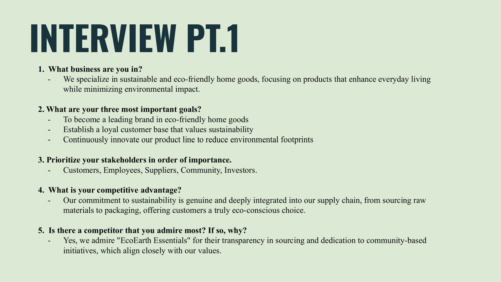
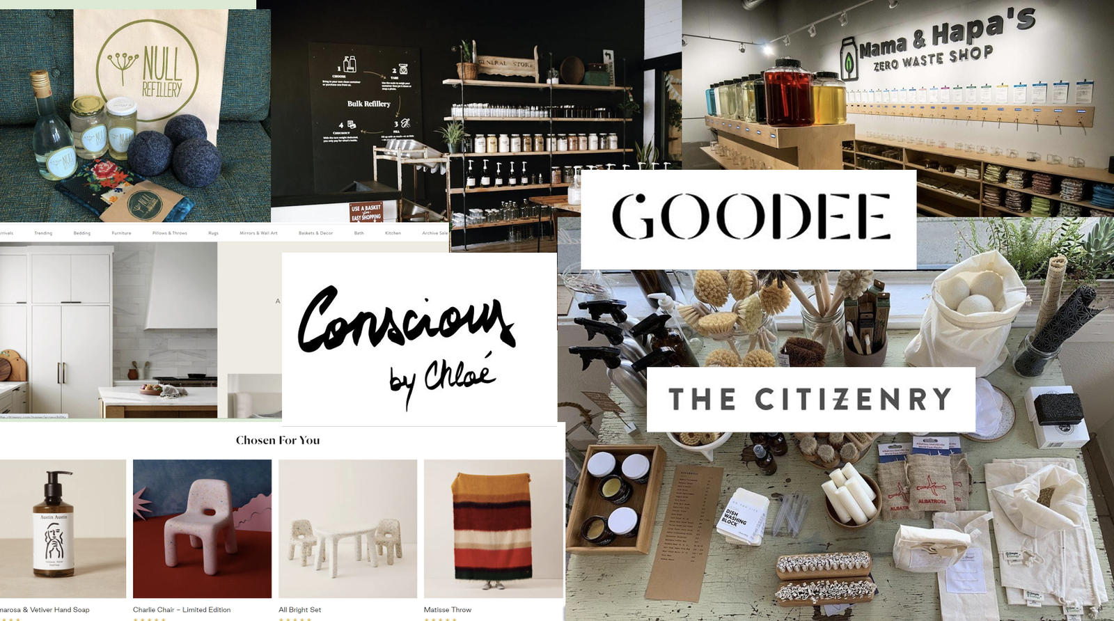
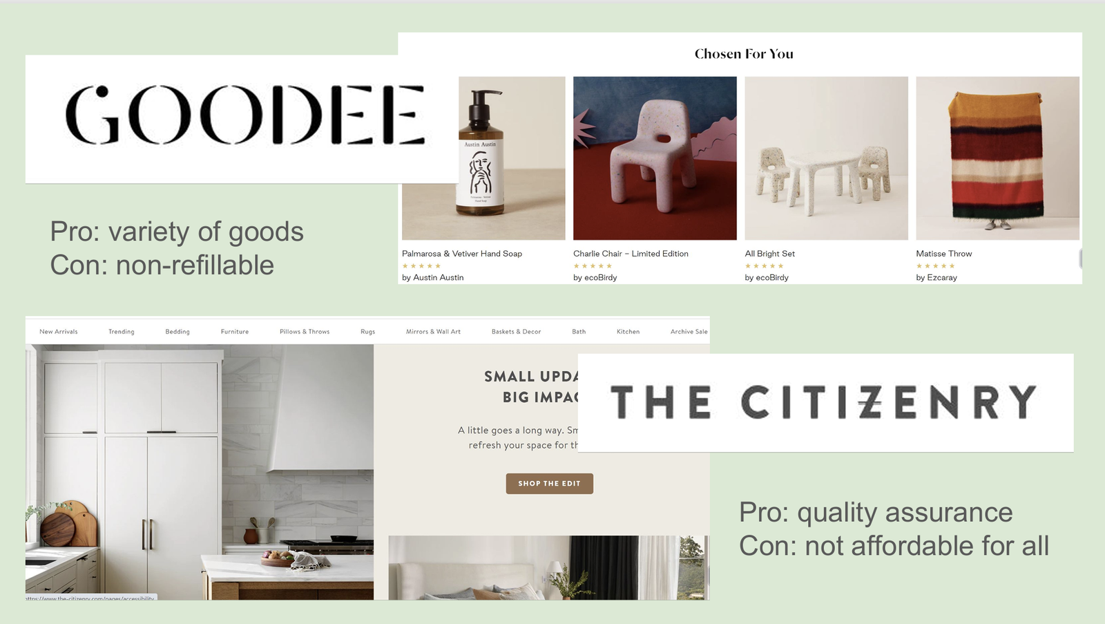
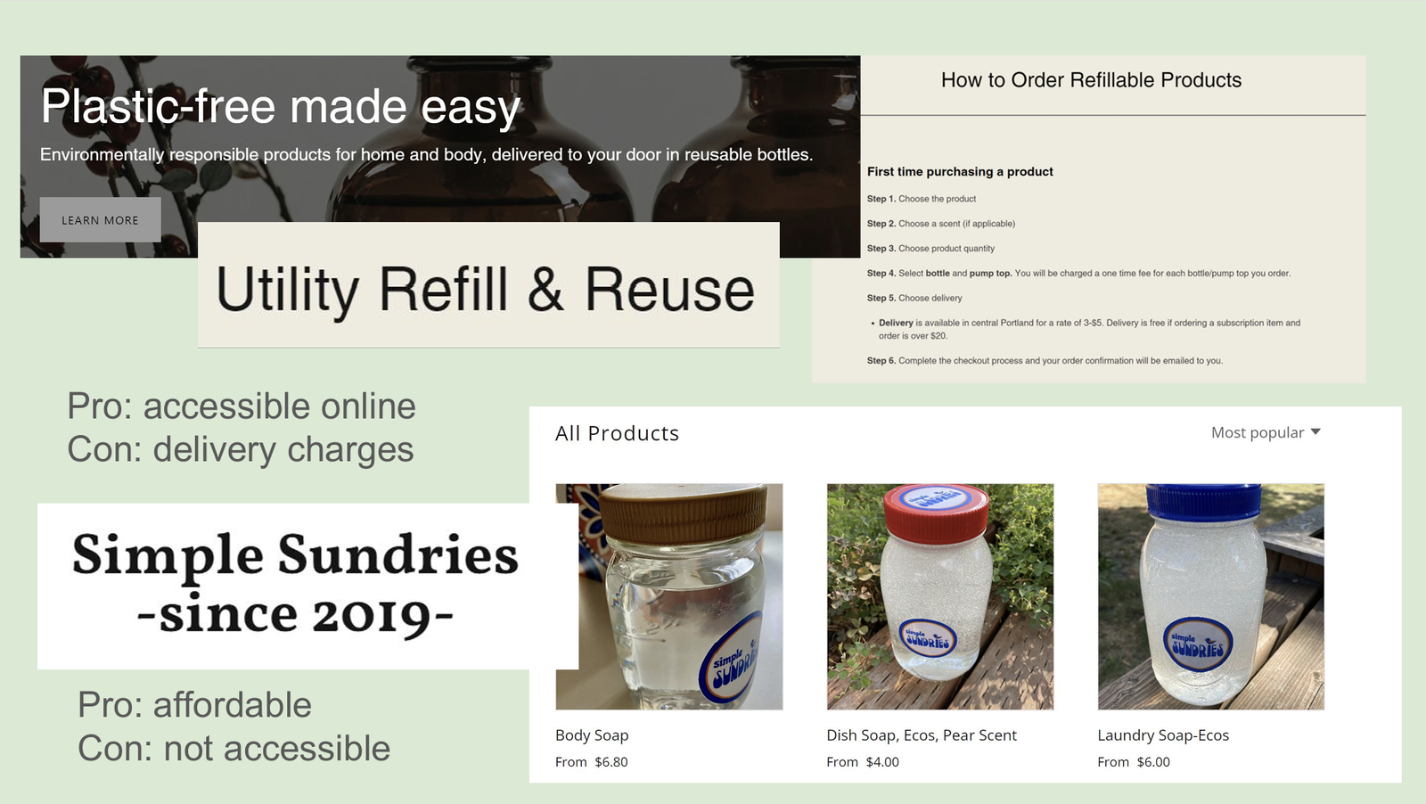
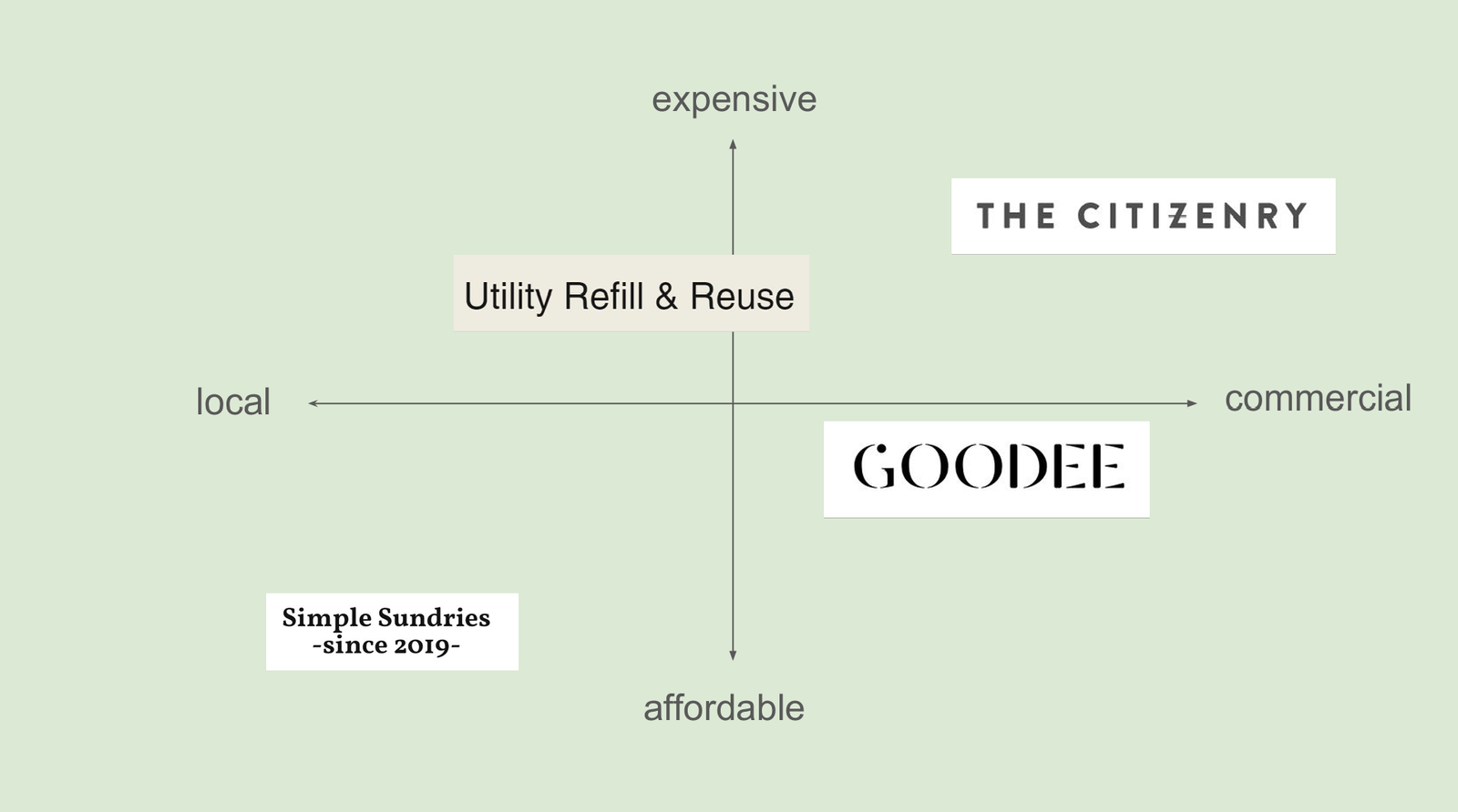
For Evergreen Essentials, our goal was to create a brand that resonates with eco-conscious consumers seeking stylish yet sustainable home essentials. To truly understand our target audience, I developed a detailed set of interview questions and conducted research to uncover their habits, motivations, and frustrations when shopping for sustainable products. In addition to user insights, I analyzed the branding strategies of various sustainable brands, identifying key factors that contributed to their success or shortcomings. To visualize market positioning, I created a matrix plotting brands from local to commercial and affordable to luxury, helping define where Evergreen Essentials fits within the sustainability landscape. These research methods ensured that every design decision was user-centric and aligned with the values of our audience.
DEFINE
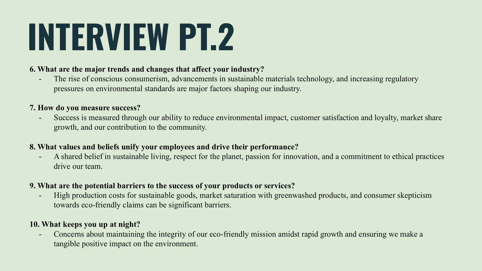
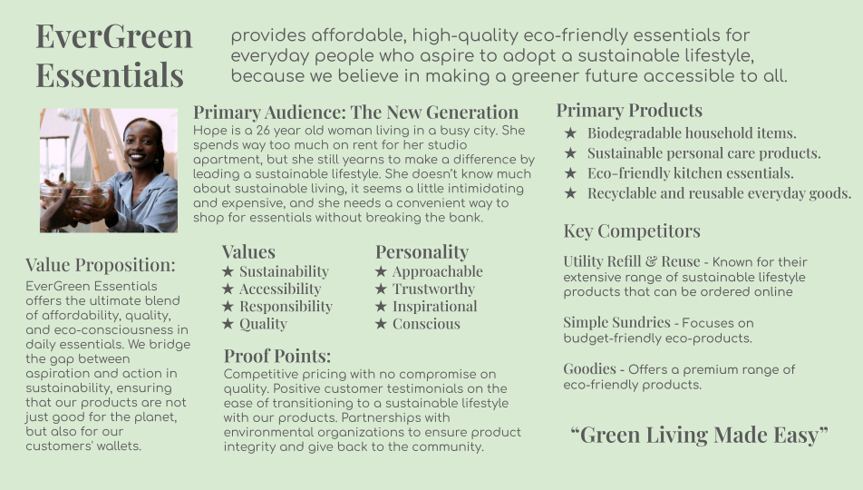
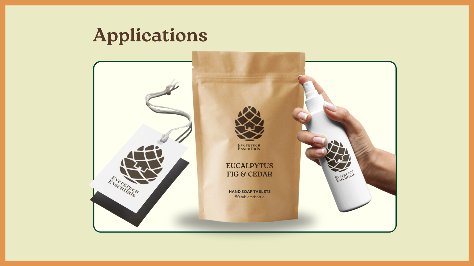
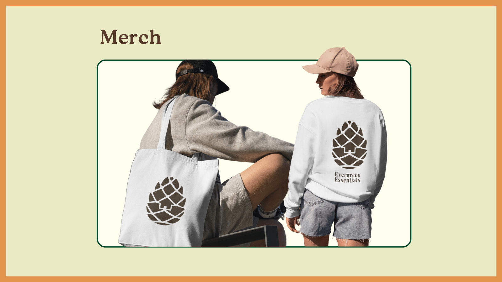
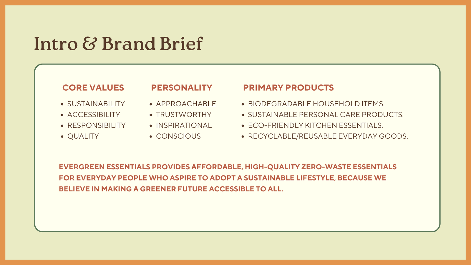
Through user interviews and market research, I identified key barriers to sustainable shopping—high cost, accessibility, and trust in eco-friendly claims. This led to a brand brief that defines Evergreen Essentials’ core values: sustainability, accessibility, responsibility, and quality. To make sustainability feel approachable, I shaped the brand’s personality as trustworthy, inspirational, and conscious. I also refined the product focus to biodegradable household items, sustainable personal care, eco-friendly kitchen essentials, and reusable goods, ensuring practicality and impact. This foundation positions Evergreen Essentials as a brand that makes sustainable living easy and accessible.
IDEATE
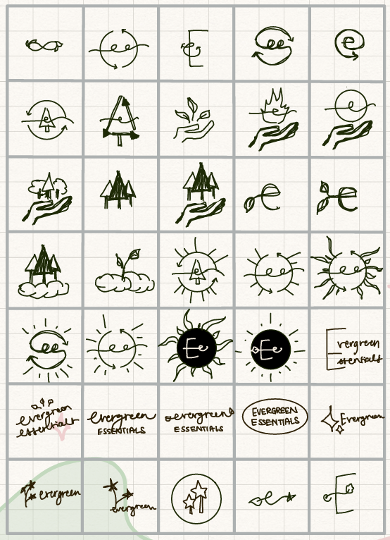
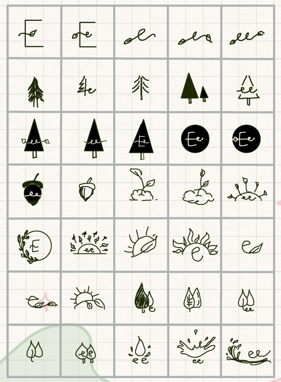
To design a logo that truly reflects Evergreen Essentials, I explored over 100 variations, focusing on nature-inspired elements like plants, water, the sun, and pine trees to represent sustainability and growth. Each concept was carefully crafted to align with the brand’s approachable, trustworthy, and conscious personality.
After refining my sketches, I developed three final logo options:
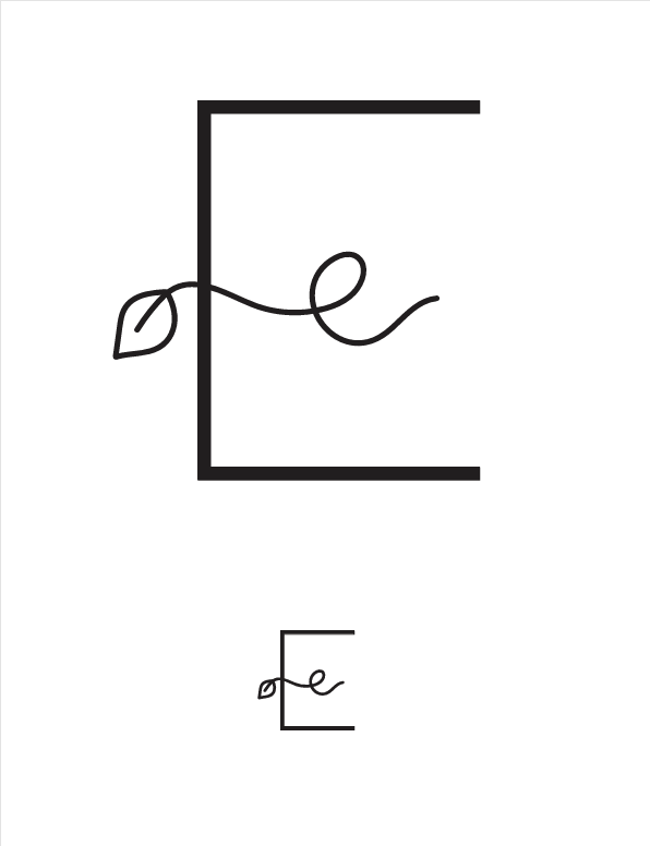
A stylized “E” with a vine, symbolizing natural growth and connection.
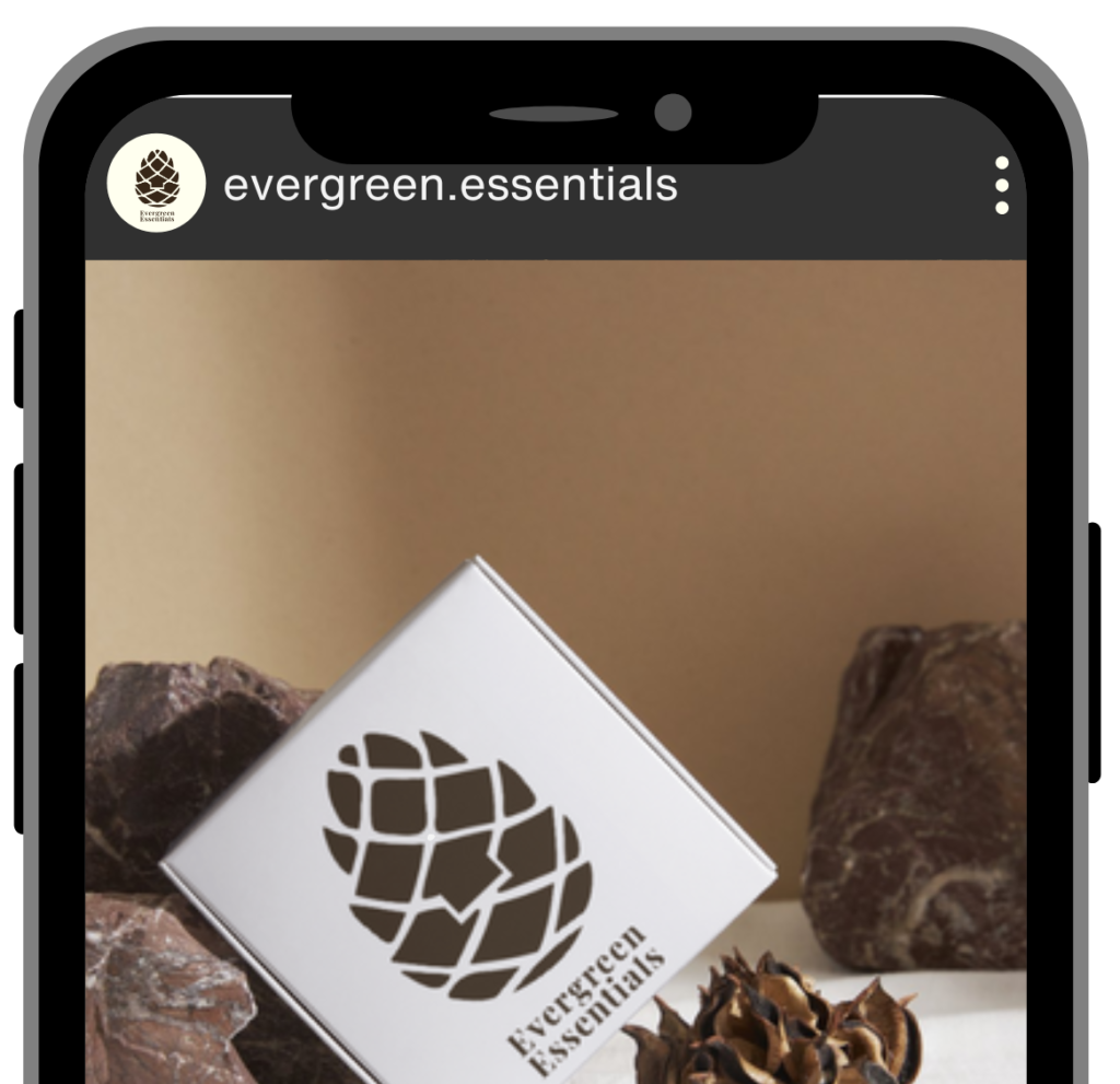
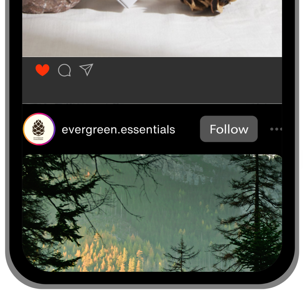
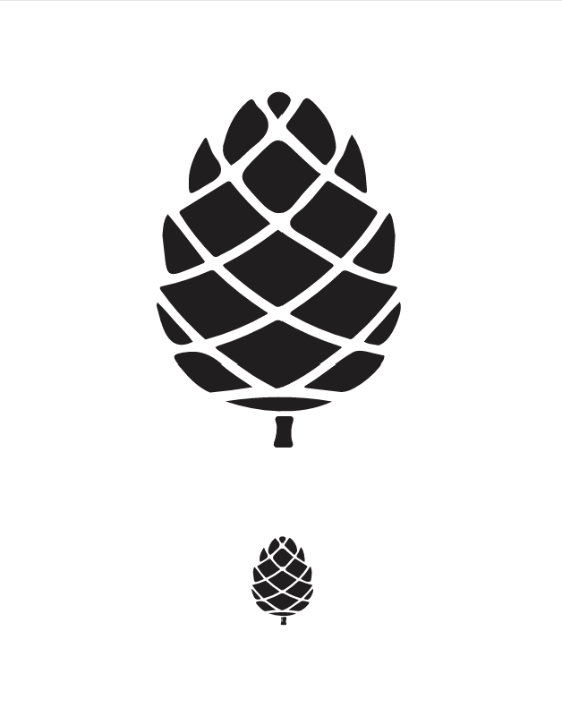
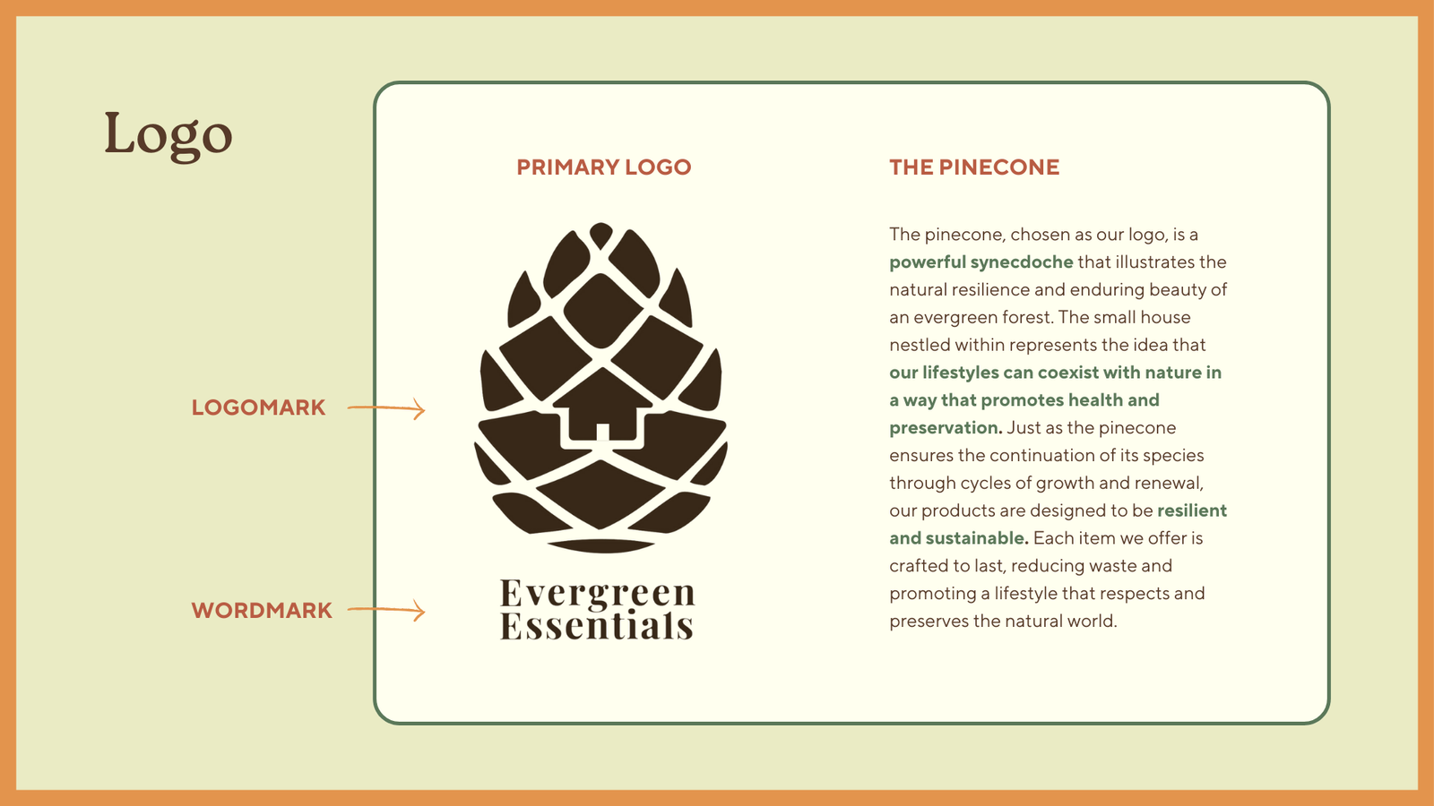
A pinecone design, embodying nature, renewal, and longevity.
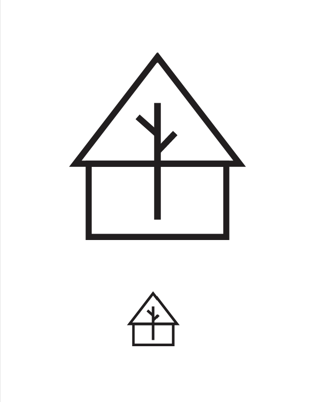
A house with a tree integrated into the structure, representing sustainability in everyday living.
These final concepts were then tested for clarity and resonance before gathering feedback to determine the strongest direction.
FINAL DESIGN
FEEDBACK & TAKEAWAYS
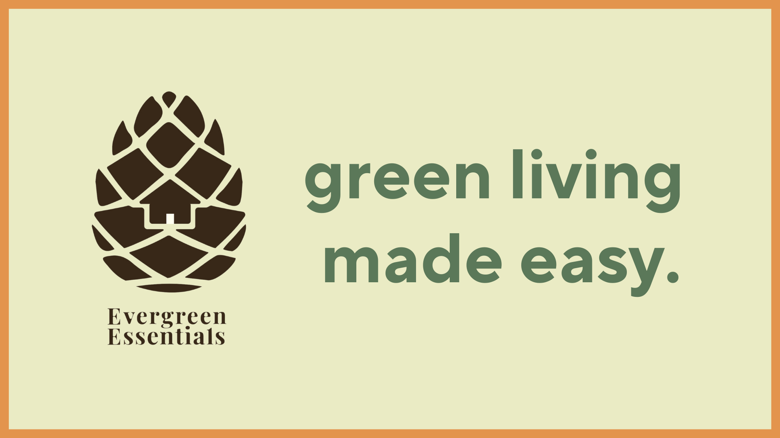
Initially, the logo featured a simple pinecone, symbolizing resilience and sustainability. However, feedback from stakeholders suggested adding an element that made it more unique and relevant to the brand’s mission. In response, I incorporated a house shape within the pinecone, representing the harmony between sustainable living and everyday life. This refinement strengthened the connection between Evergreen Essentials’ values and its visual identity.
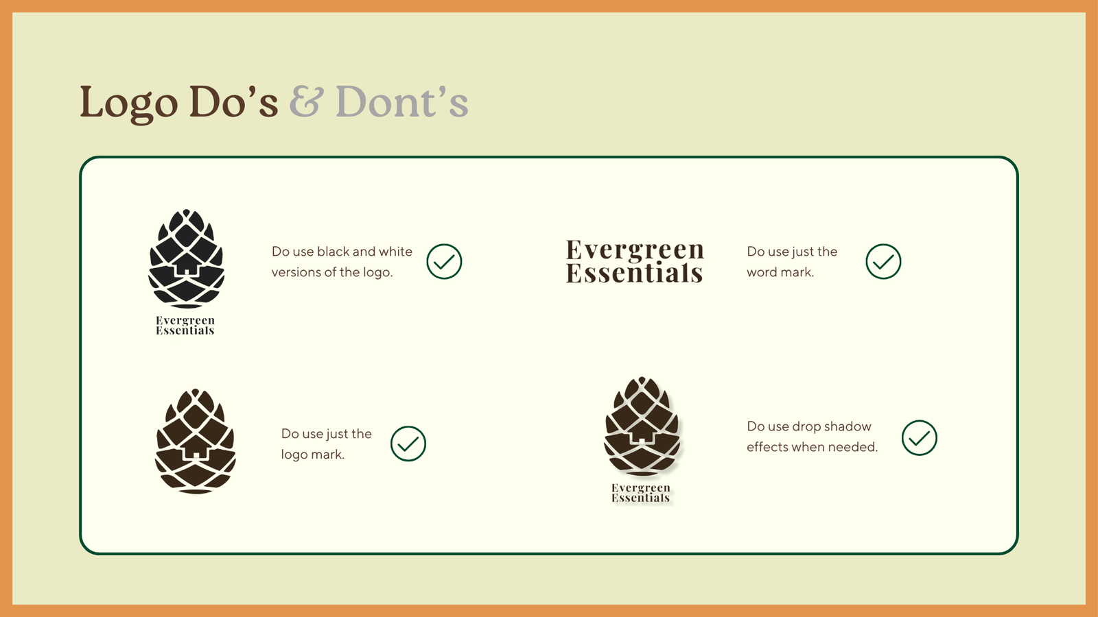
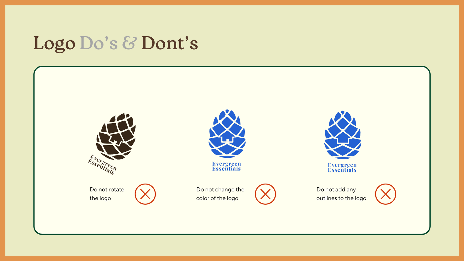
Alongside this, I developed a brand guide to ensure consistency in messaging and design. Presenting it to stakeholders provided key insights on clarity, positioning, and visual cohesion, helping refine the brand’s overall presence.
This process reinforced the importance of iterative design and feedback-driven improvements, ensuring that Evergreen Essentials communicates both practical sustainability and a meaningful lifestyle choice.