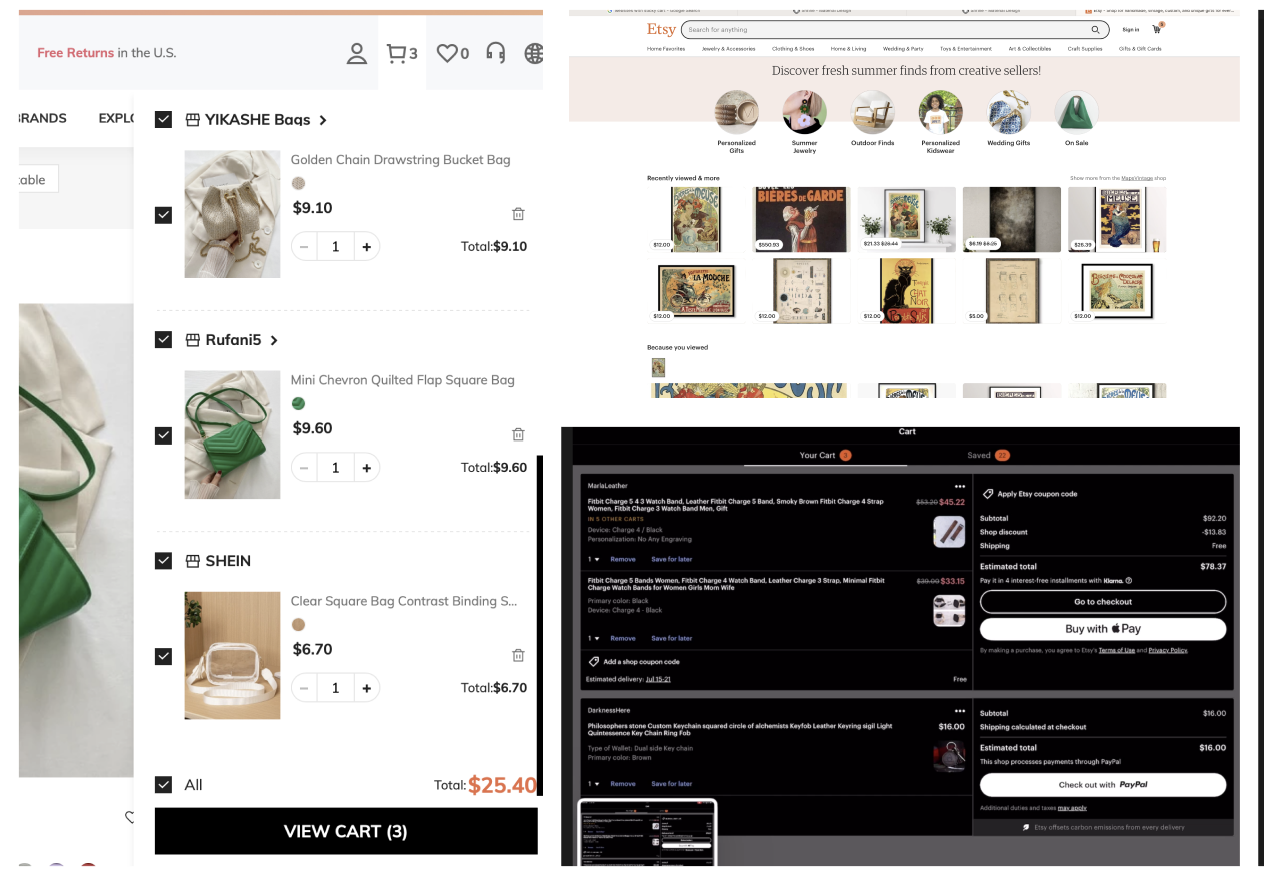
As a summer intern at Cat Digital, I had to go to extra lengths to understand the users I would be implementing this feature for. The Parts.cat.com website is buyer-to-buyer, making these users’ needs significantly different than your average commercial buyer. I asked questions to my colleagues, researched Cat’s business model, and sought a deeper understanding of the demographic I was going to be working for.
DEFINE
After 2 weeks of research, I outlined my goals for the projects as such:
As a user, I want to quickly see what items are in my cart as I shop so that I am confident in my selections and prices.
As a business, I want to guide my users to our checkout process as soon as possible so that they can place an order.
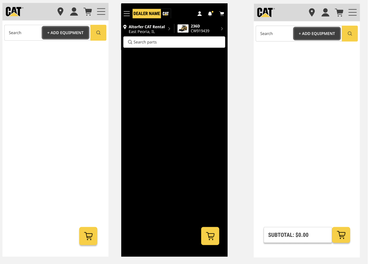
Ensure the UI does not conflict with the footer of the website.
Ensure the UI does not conflict with the Navigation bar of the website.
IDEATE
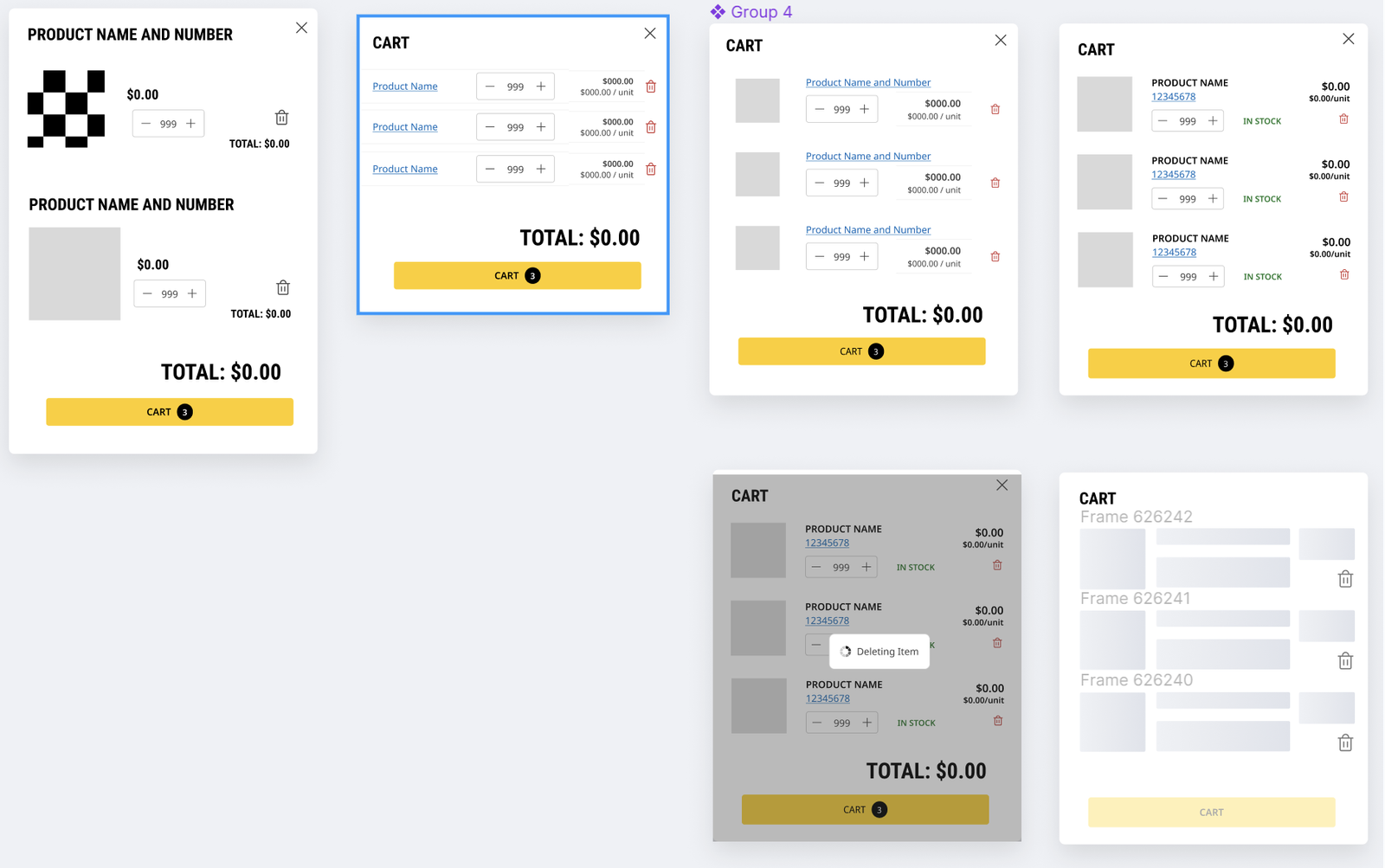
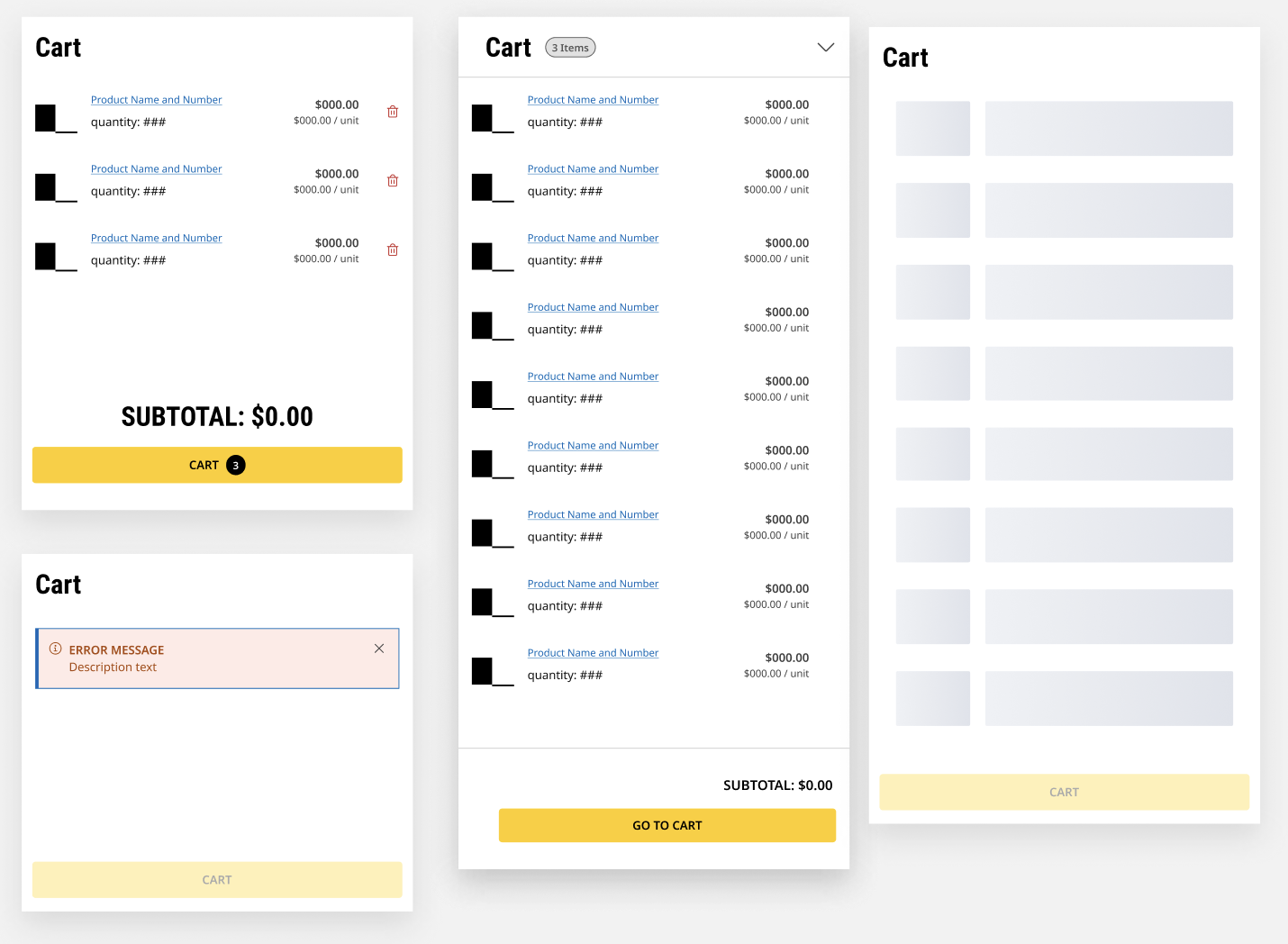
I began drafting multiple components and elements using CAT’s design system “Blocks 2.0”, making sure I was meeting each requirement I was presented. After I created multiple drafts during the ideation process, I consulted with my team to get feedback on the direction I was headed. After this discussion, I was tasked with a new pivot in the requirements.
As a business, I do not want to impact the behavior of the Cart Icon in the header, so that users always navigate to the cart page via this icon.
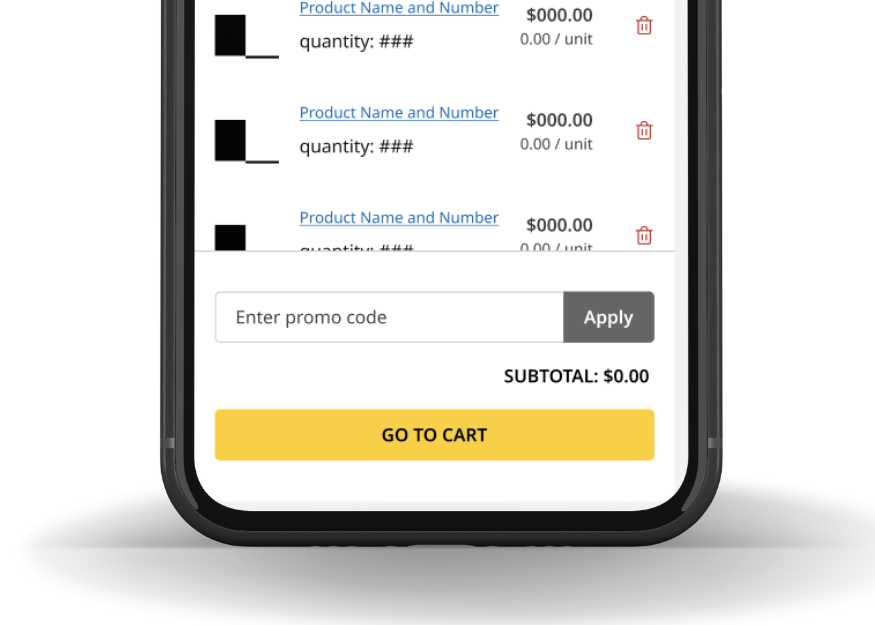
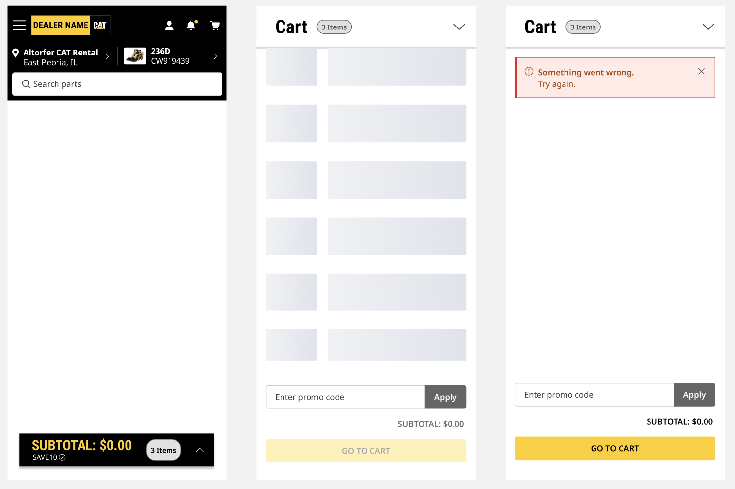
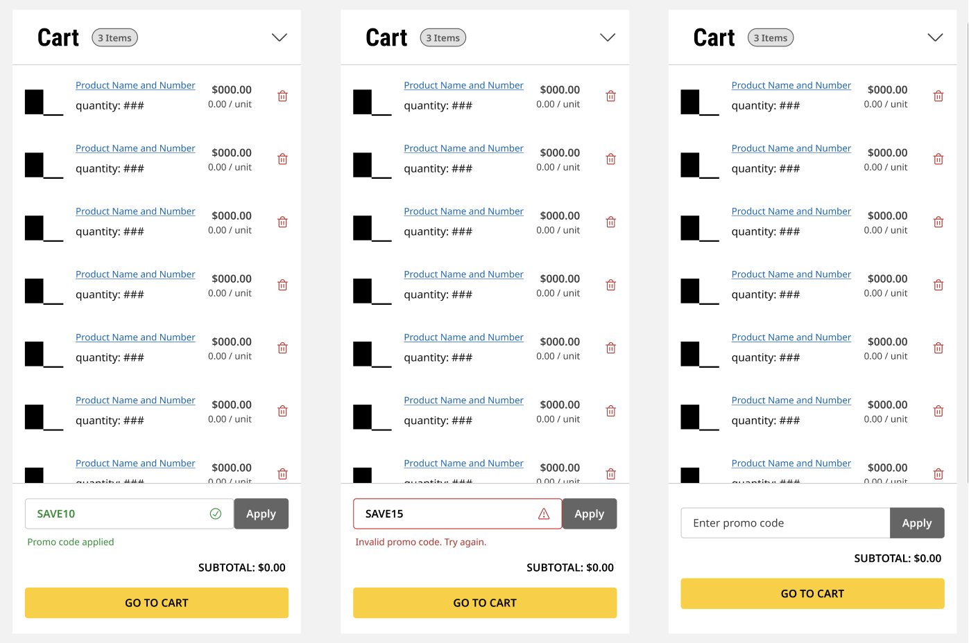
As a business, I want to allow a user to add a promo code from this persistent cart so that they can see their accurate subtotal while shopping.
PROTOTYPE
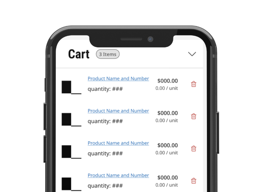
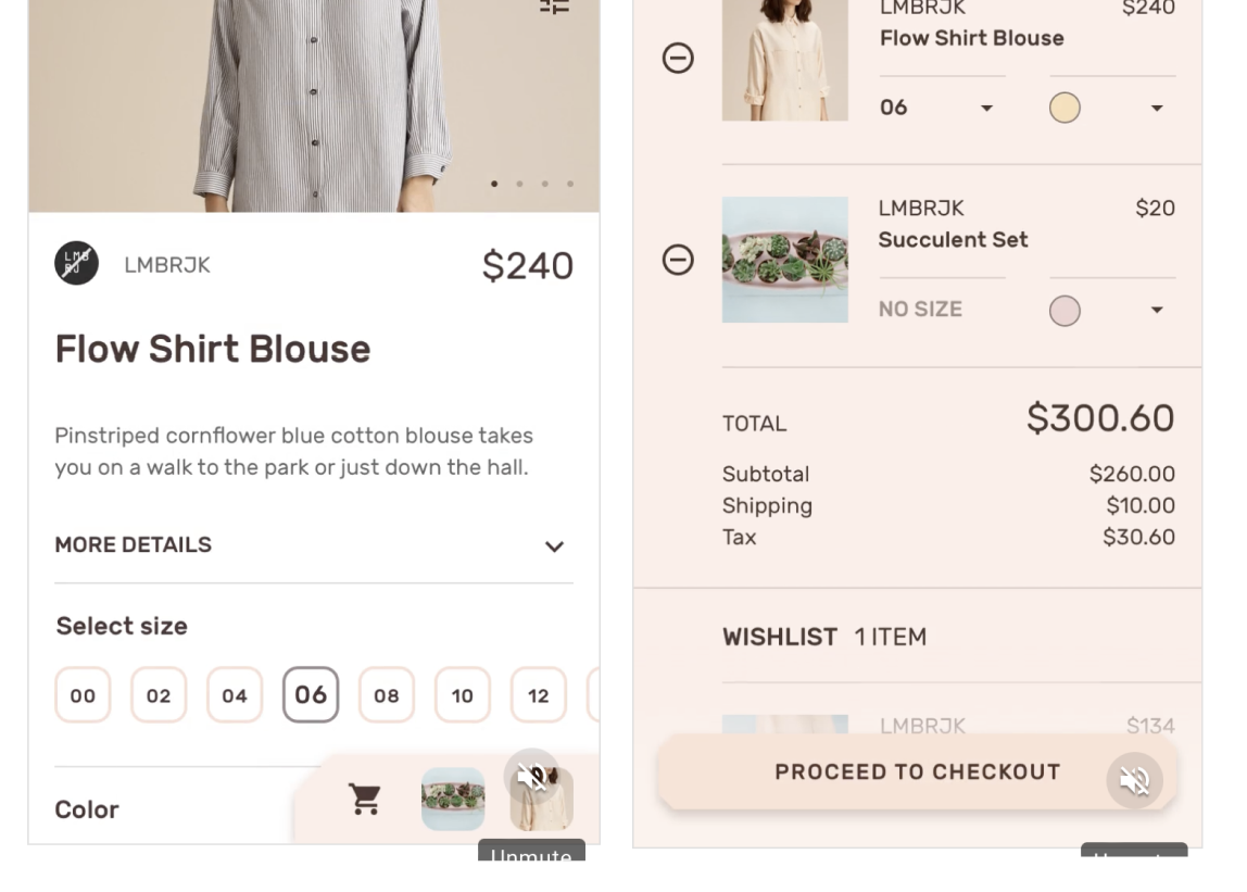
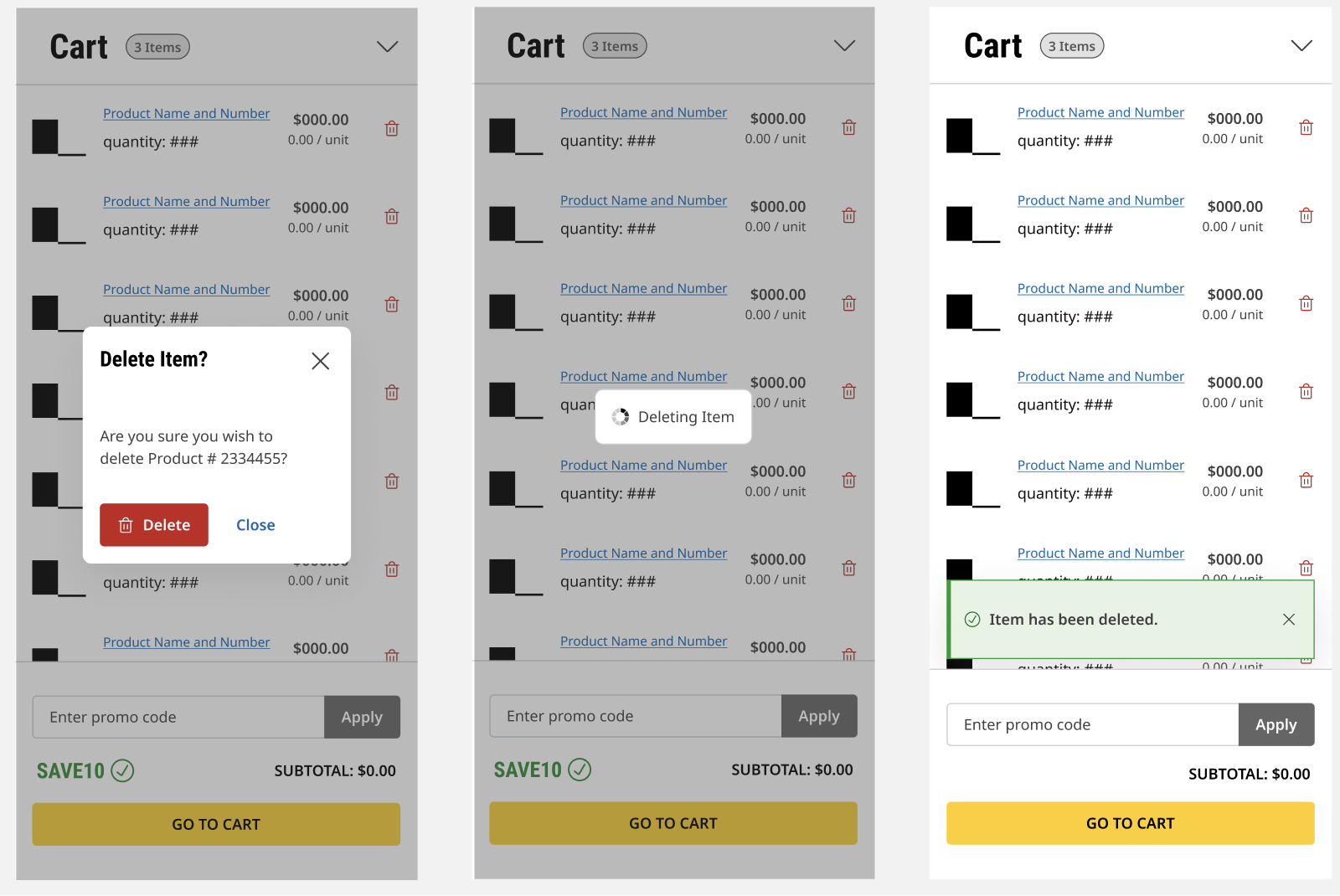
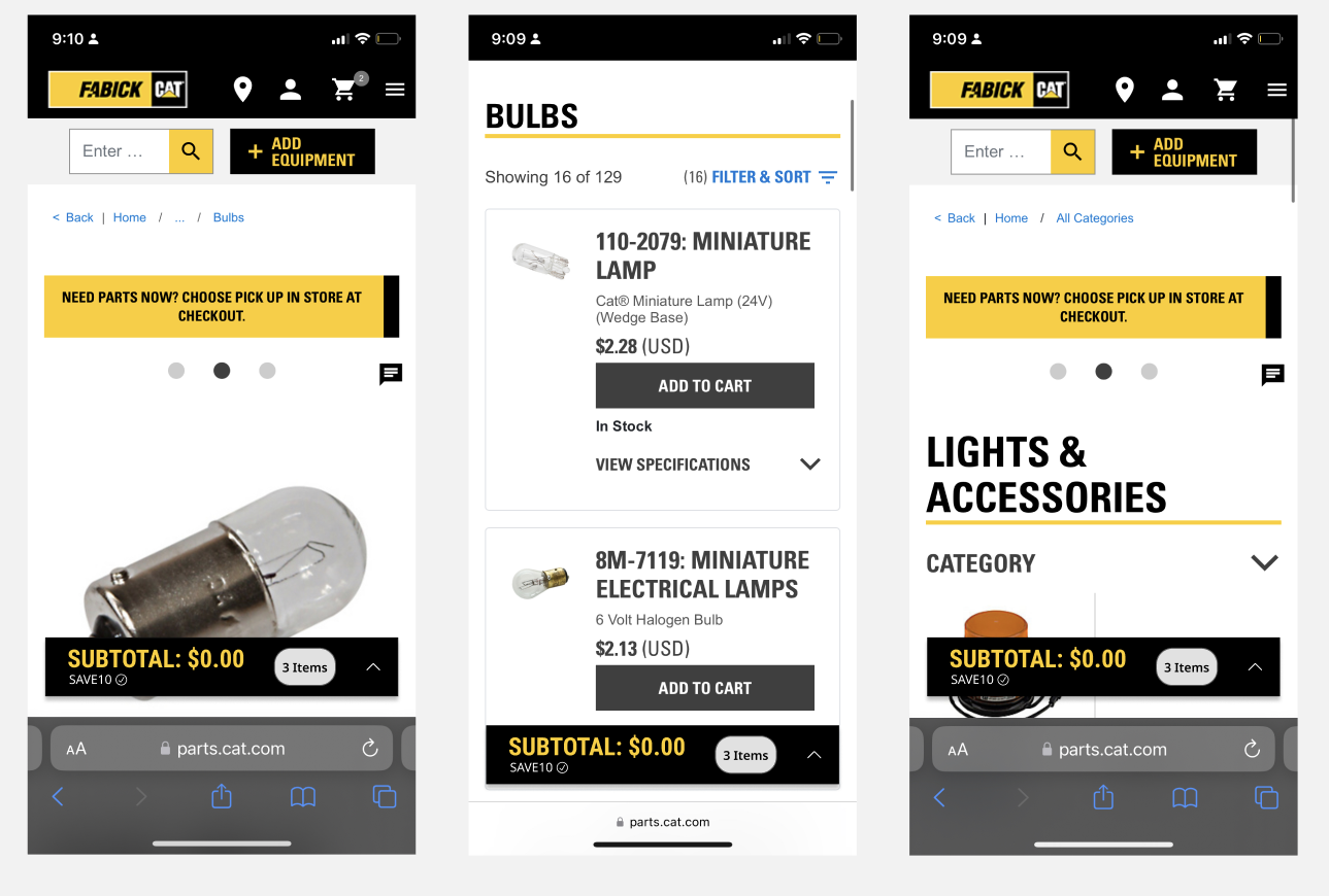
After many conversations and adjustments, I completed a prototype for the persistent shopping cart that met all user and business requirements. This cart is easily accessible on any page as a small square icon on the bottom right hand of the screen. When clicked, it enlarges to show a view of the user’s shopping cart- which has crucial information such as quantity, price, and price per unit. The prototype is straightforward and clean, focusing on functionality and recall formatting to connect with the buyer-to-buyer demographic. The promo code gives quick responsive feedback and the cart minimizes using a drawer pattern to maximize efficiency.
FEEDBACK
At the end of my internship, I had completed most of the design thinking process for my persistent cart process, but I knew that feedback from the user would be crucial for the understanding of my success and improvement. I contacted the stakeholders of this product and gave a demonstration of my prototype, starting from the research to the end product. The stakeholders gave me valuable insight into how this new feature would be greatly beneficial from the business perspective. They mentioned how previous user feedback mentioned how an easy-to-access cart improves their efficiency as they browse the parts website, allowing them to quickly check key information without interrupting their shopping flow. Overall, I learned an incredible amount from this process- especially in regards to working with corporate Design Systems and buyer-to-buyer business models with UI/UX.