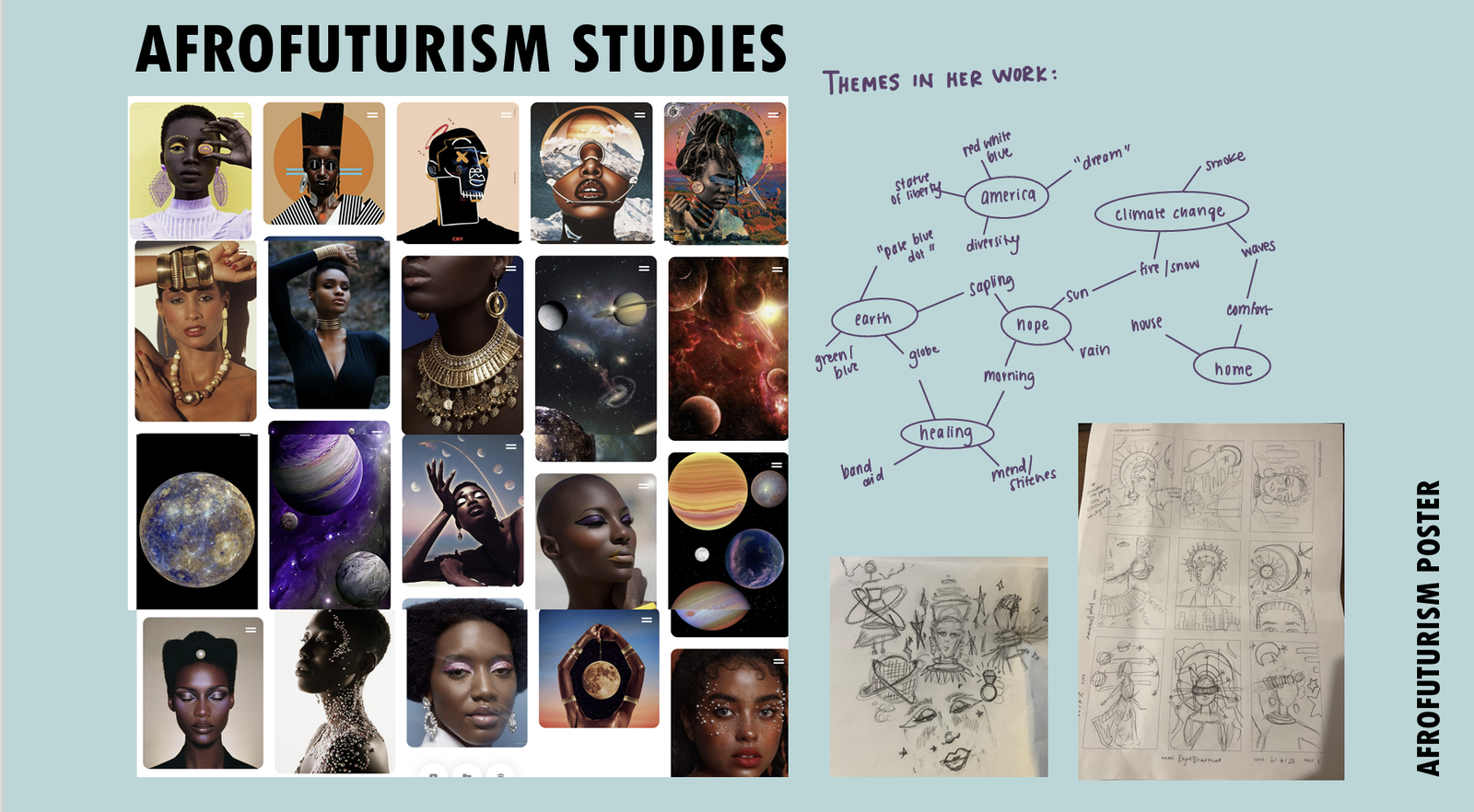
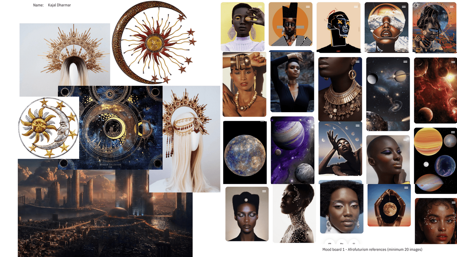
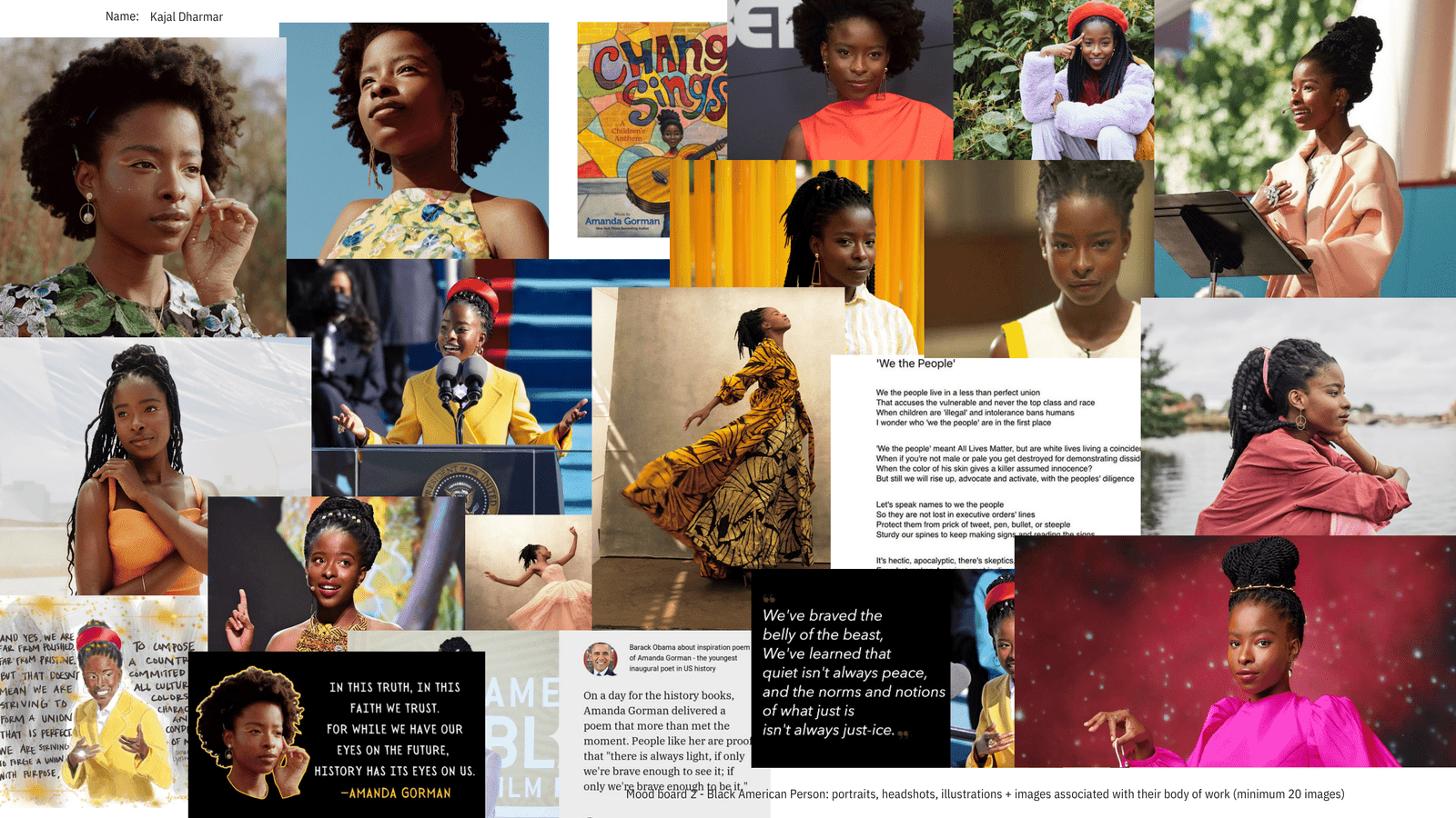
The project commenced with a deep dive into Afrofuturism and the works of Amanda Gorman, a young black poet celebrated for her verses on hope and nature. My goal was to intertwine her literary themes with Afrofuturistic visuals to create a compelling poster narrative. Initial research on Afrofuturism’s roots and its artistic expressions, alongside a thorough study of Gorman’s poetry, laid the foundation for this creative endeavor, ensuring an authentic and resonant design.
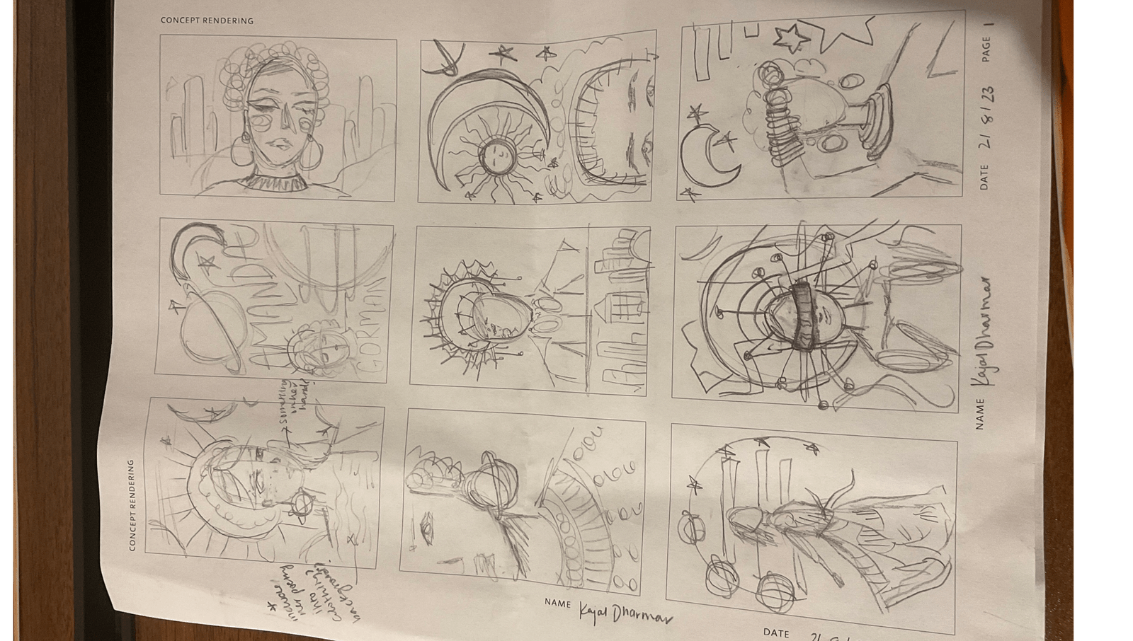
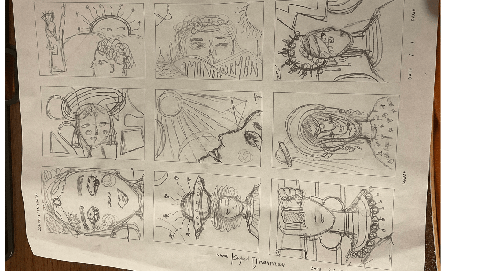
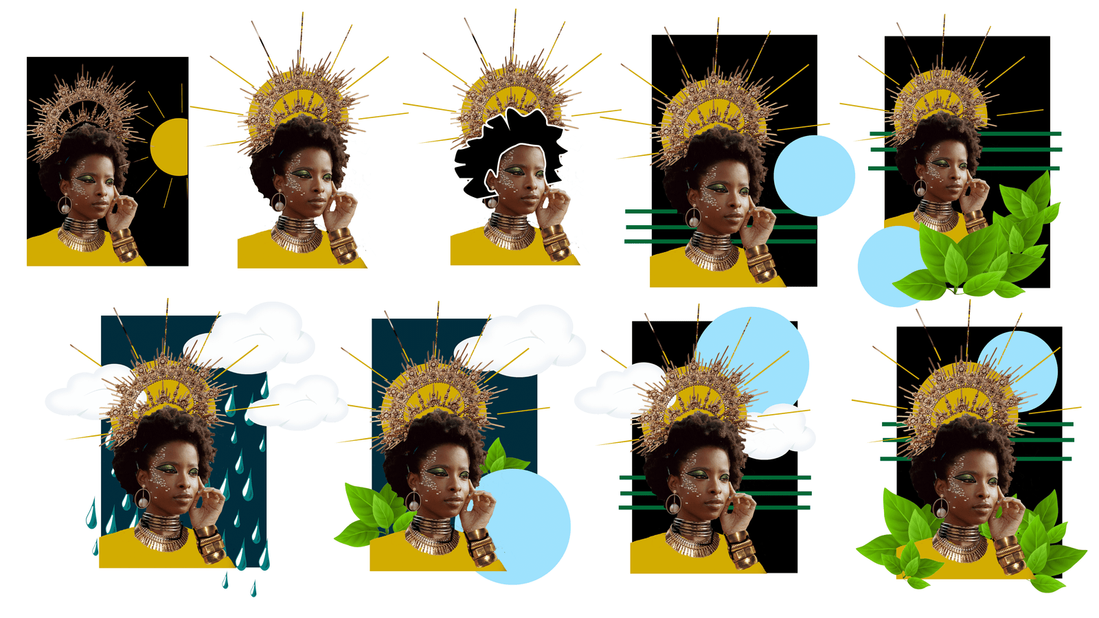
The ideation phase involved sketching forty different poster concepts, seeking a harmonious blend of Gorman’s poetry with Afrofuturistic aesthetics. The most promising ideas were then digitized, employing Photoshop and Illustrator to experiment with design elements like color, scale, and texture. This digital exploration allowed for refined manipulation, gradually shaping the poster’s final look.
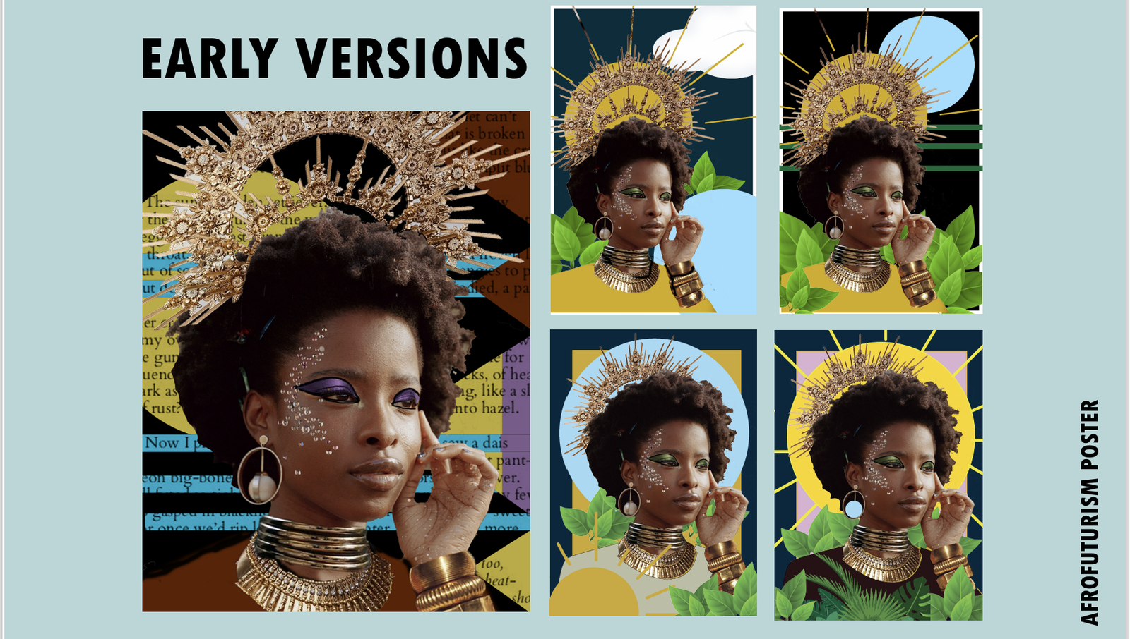
Further refinement led to twenty variations, tweaking color, layout, and size to perfection. This iterative process was driven by a commitment to encapsulate Gorman’s essence and the Afrofuturistic spirit accurately. The final poster emerged as a visual tribute to Gorman, featuring Afrofuturistic elements such as regal gold jewelry and symbolic makeup, alongside motifs of nature and renewal that echo her poetic themes.
The artwork effectively portrays Gorman in an Afrofuturistic setting, with details like gold adornments and a pale blue pearl earring linking back to her poetry. The backdrop, infused with greenery and a rising sun, visually narrates her themes of hope and healing, presenting her as a symbol of optimism in the Afrofuturistic landscape.
ADCDerium
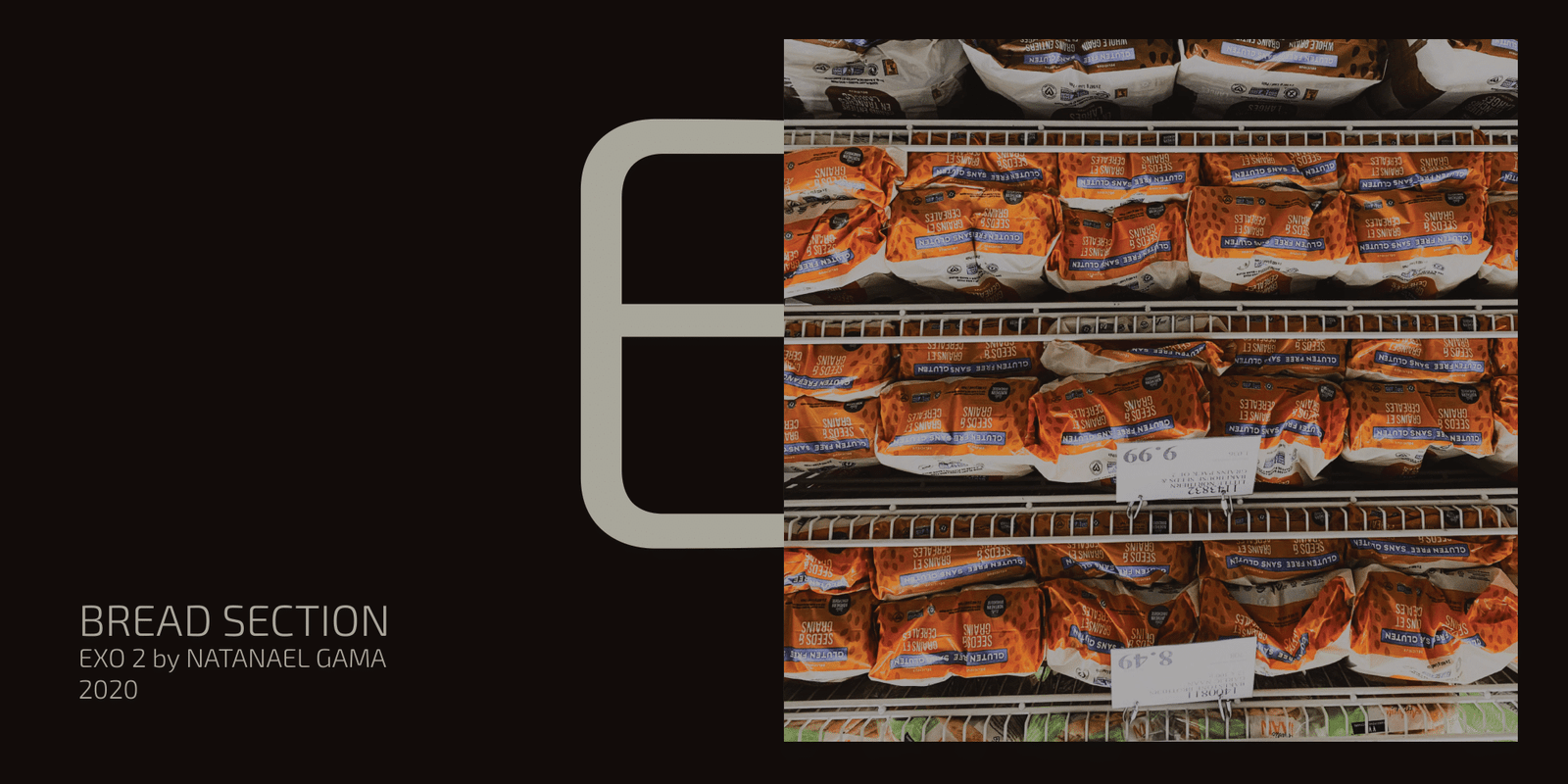
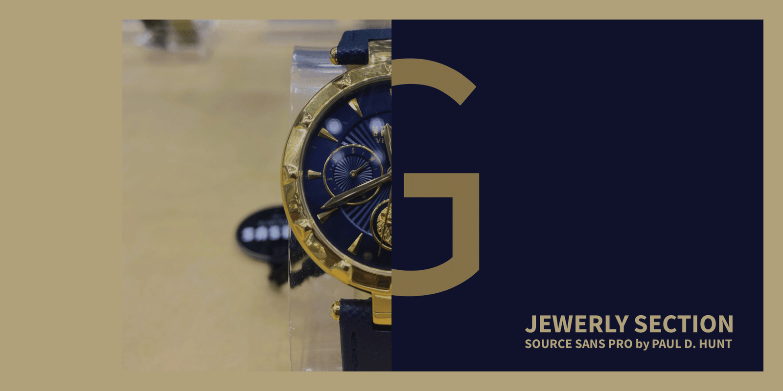
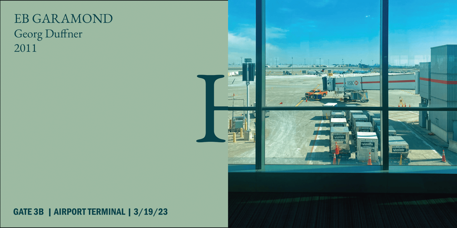
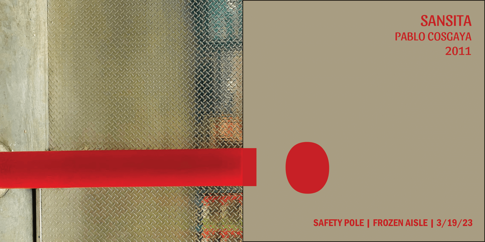
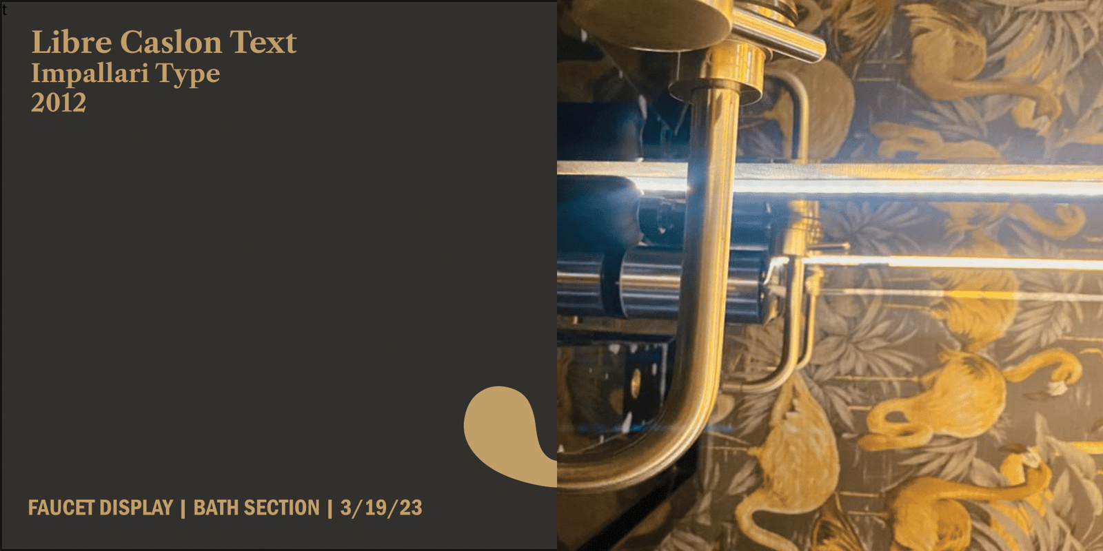
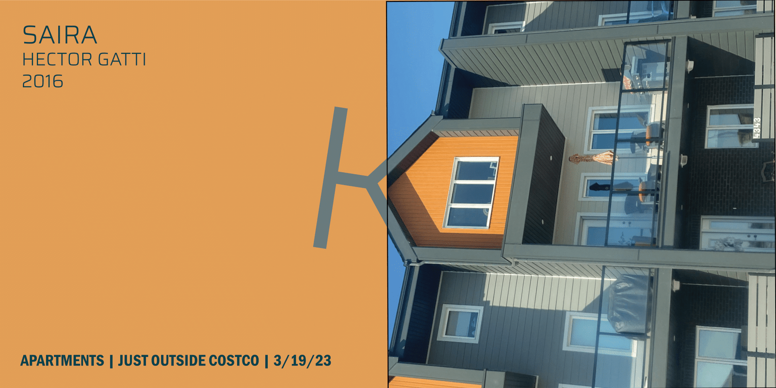
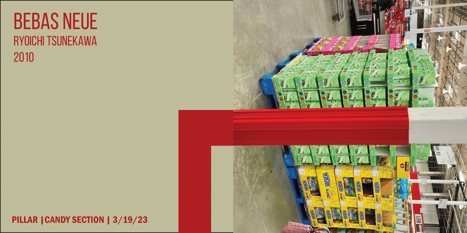
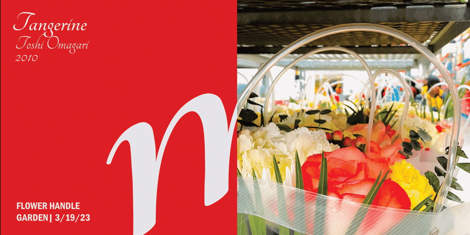
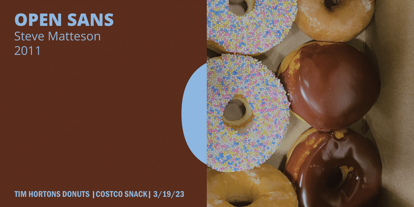
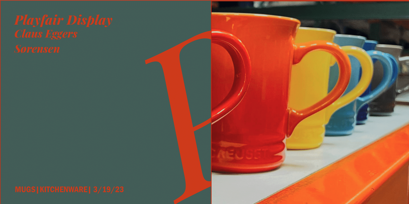
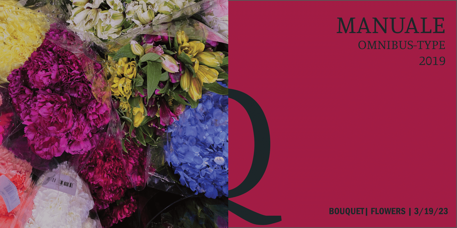
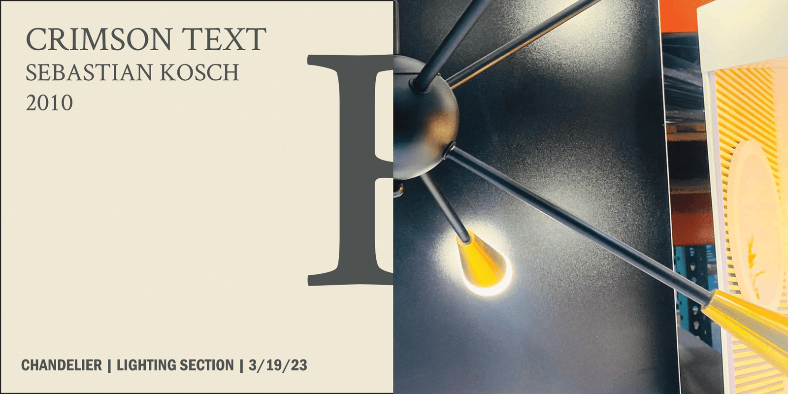
The ABCDerium project blends typography with scenes from a Canadian Costco into an engaging alphabet book. It features 26 images, each linked to a letter and matched with a font that complements its look.
The project started with photographing Costco’s diverse visuals, focusing on color contrasts, shapes, and sizes. The main challenge was matching these images with suitable letterforms. This required iterative trials to find the right balance and harmony, considering color, scale, and orientation for each pairing. The final result is a series of carefully refined image-letter combinations, making each page of the ABCDerium visually cohesive and interesting.
Magazine layout
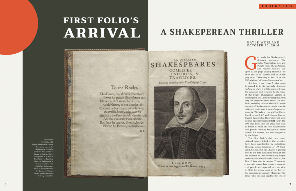
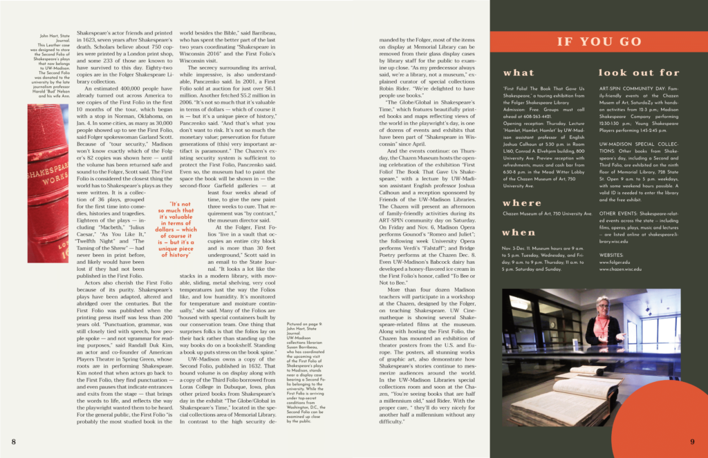
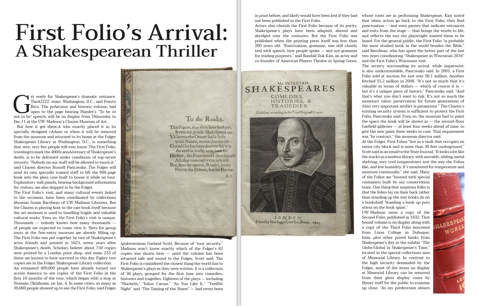
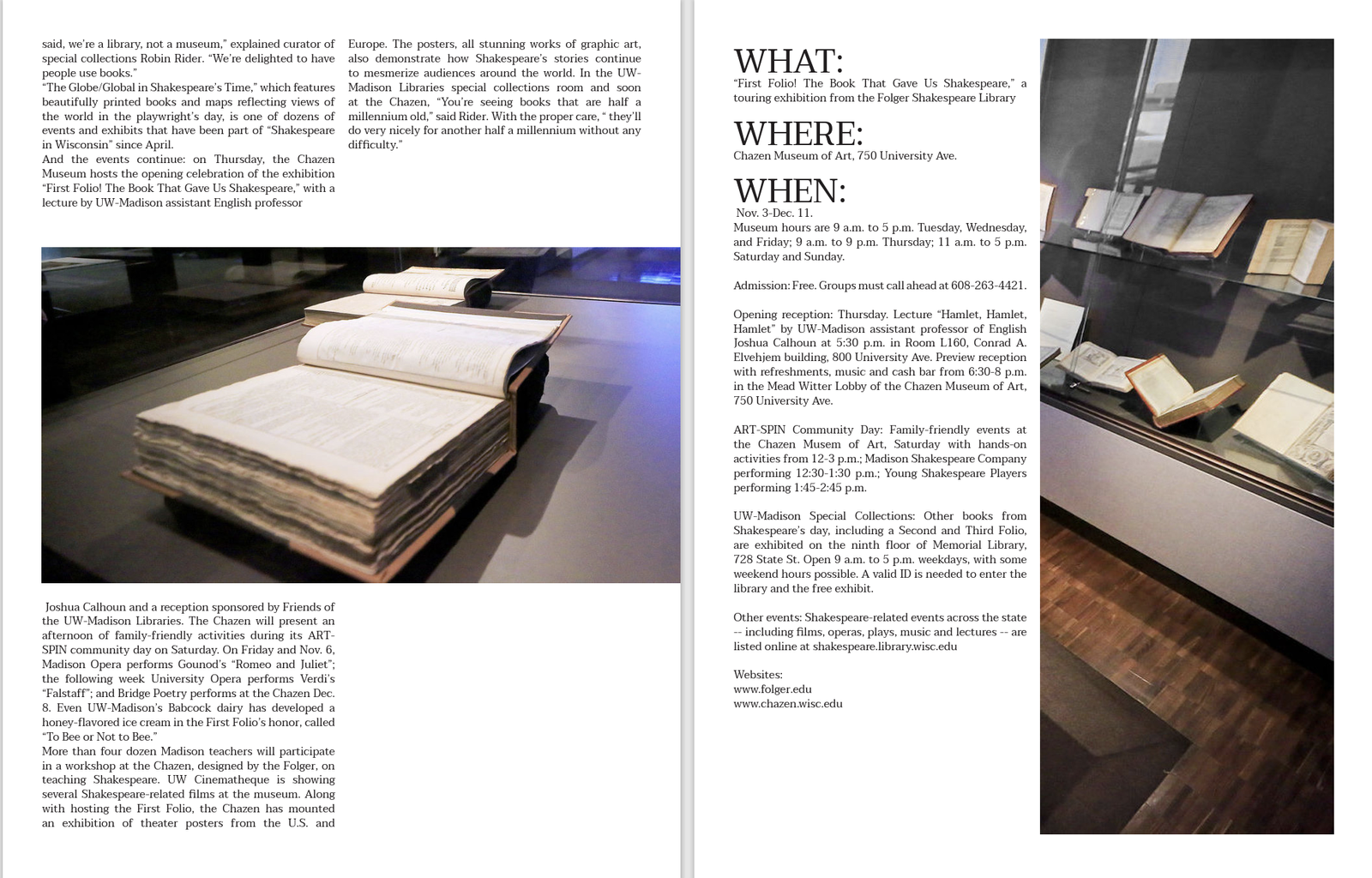
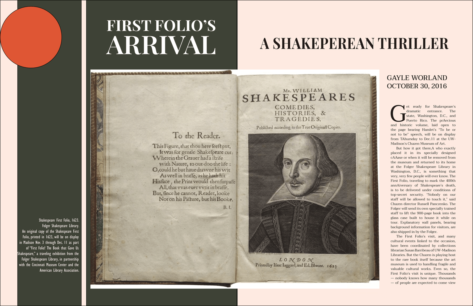
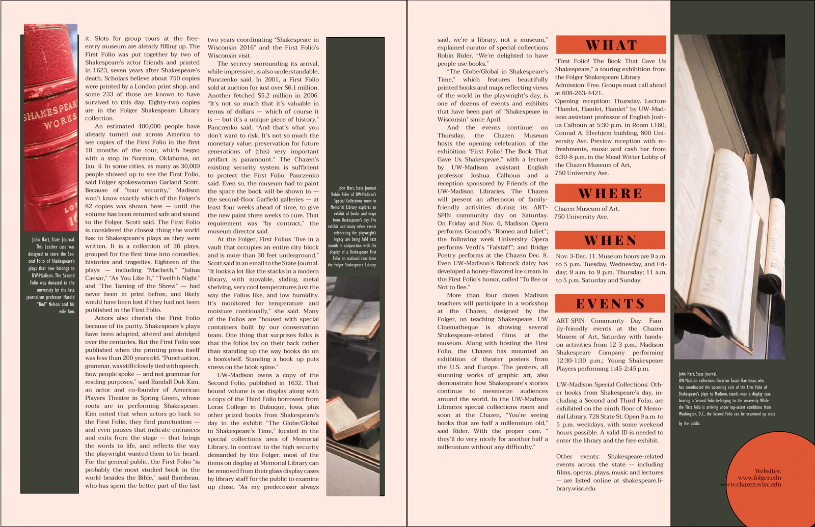
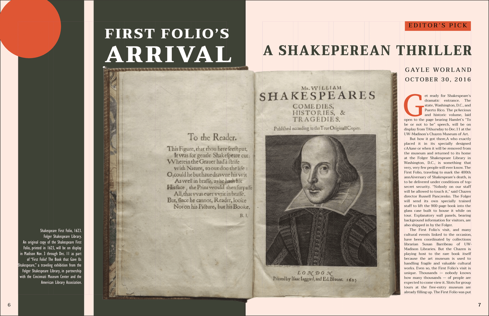
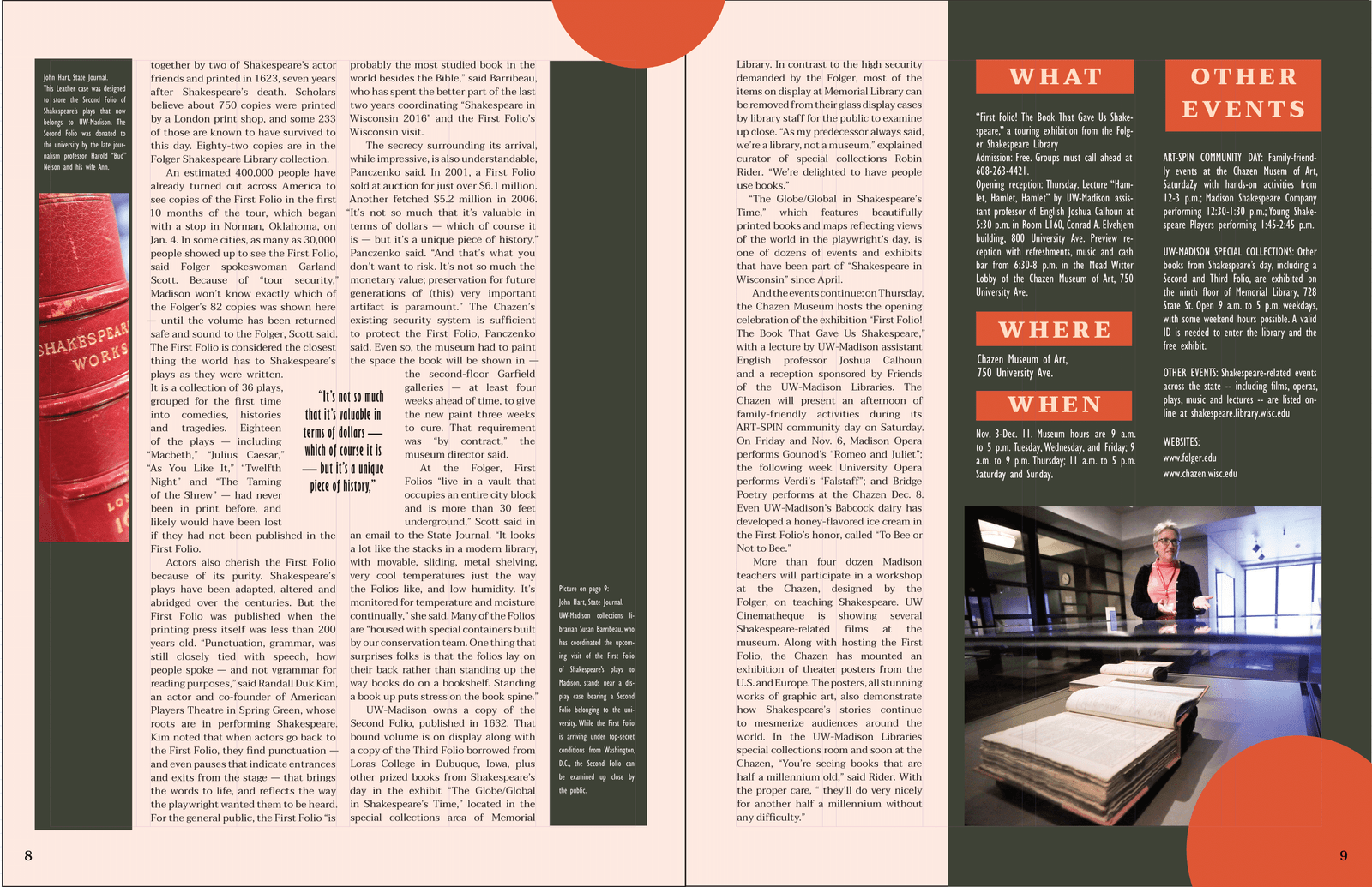
For my magazine layout assignment, I started by testing different fonts to get the right texture for the body text, making sure it resonated with the historical and literary significance of Shakespeare’s folio. After settling on the fonts, I drafted a rough layout, which was followed by two more iterations where I refined the design elements. The final layout underwent several changes, particularly in incorporating negative space to give the text and images room to breathe and create a natural flow for the reader. I chose contrasting but muted colors for a visually appealing effect, aiming for a design that would be pleasing to the eye and engaging for the readers as they learn about the folio’s tour to Madison.
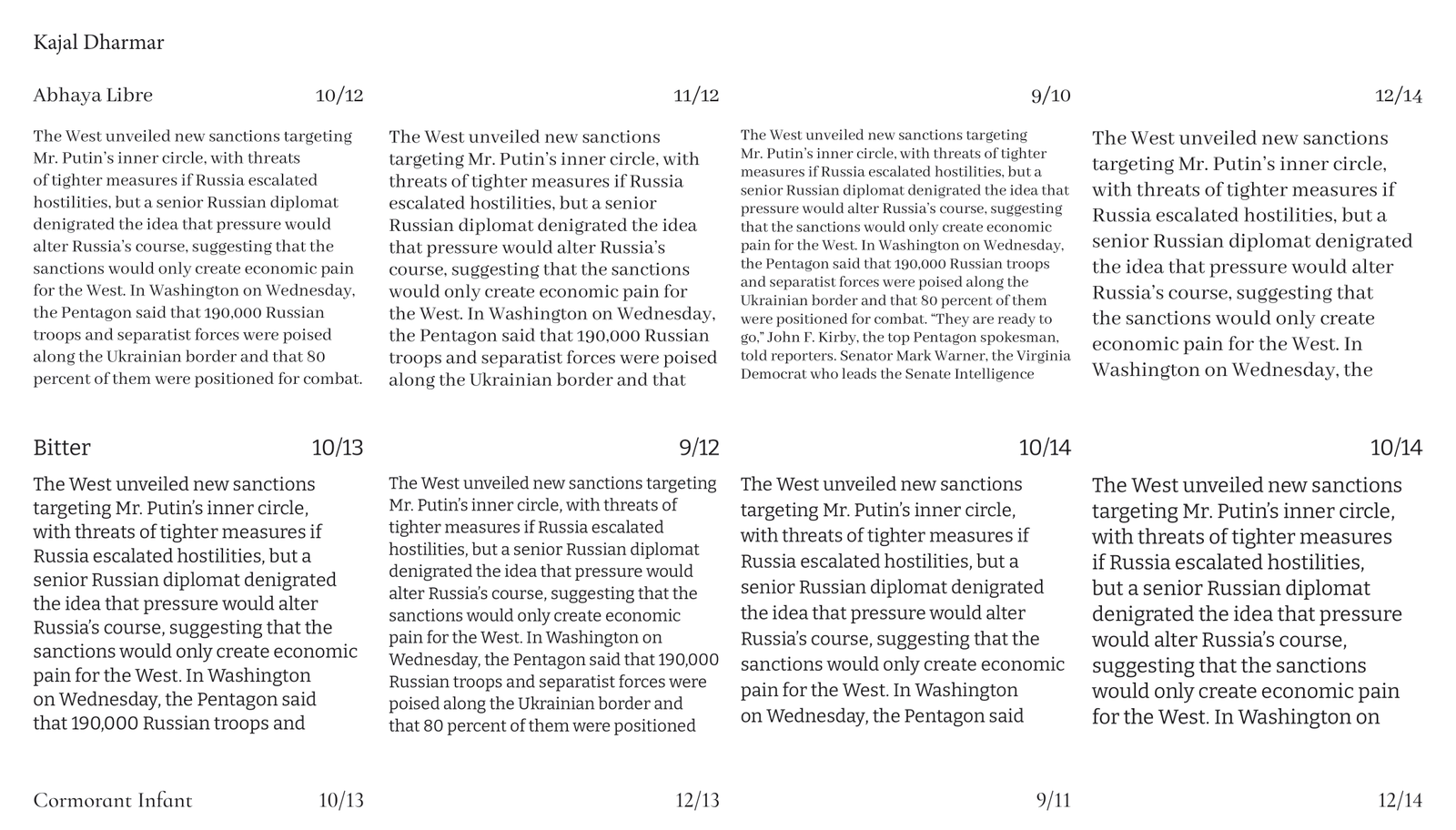
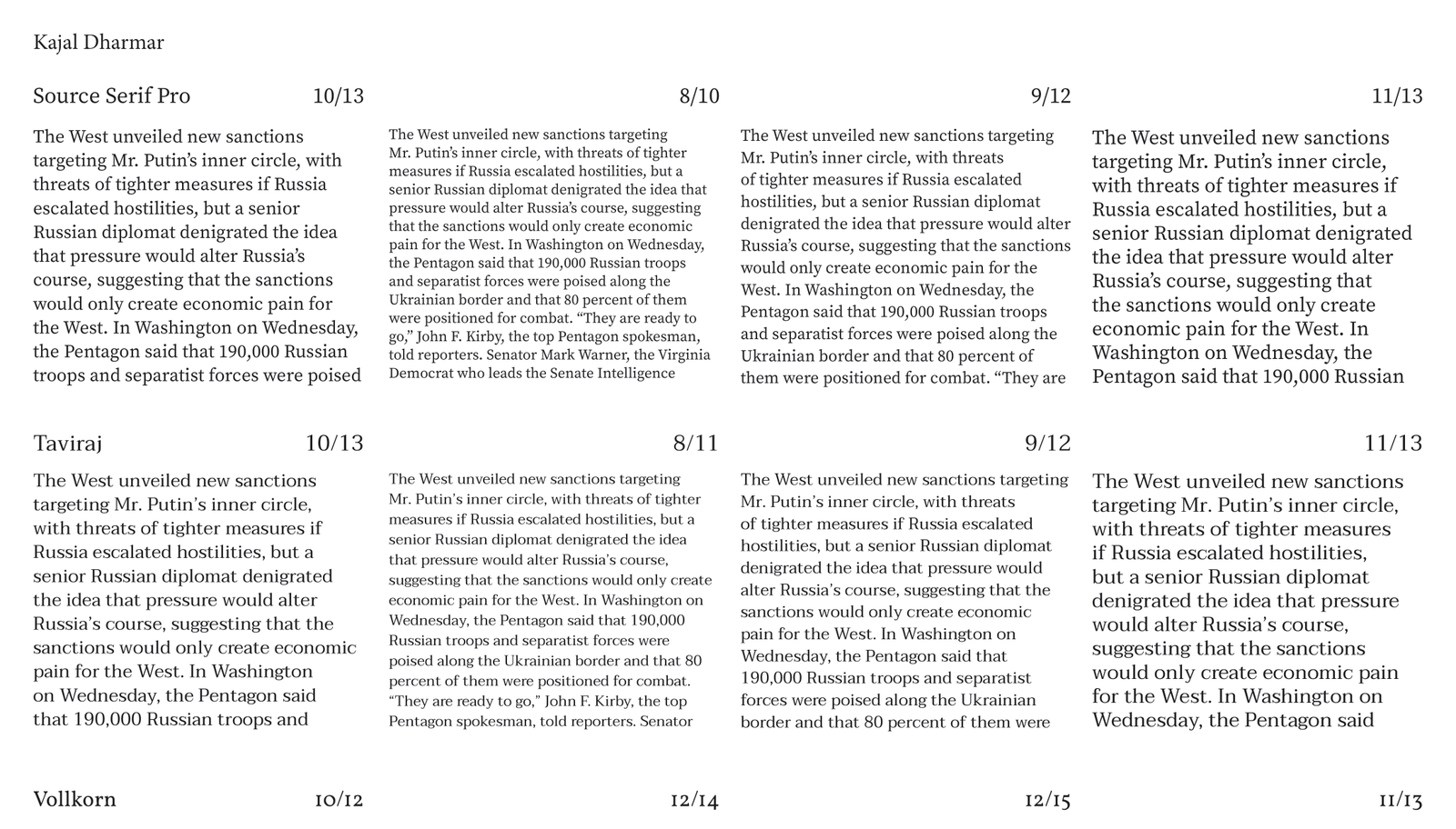
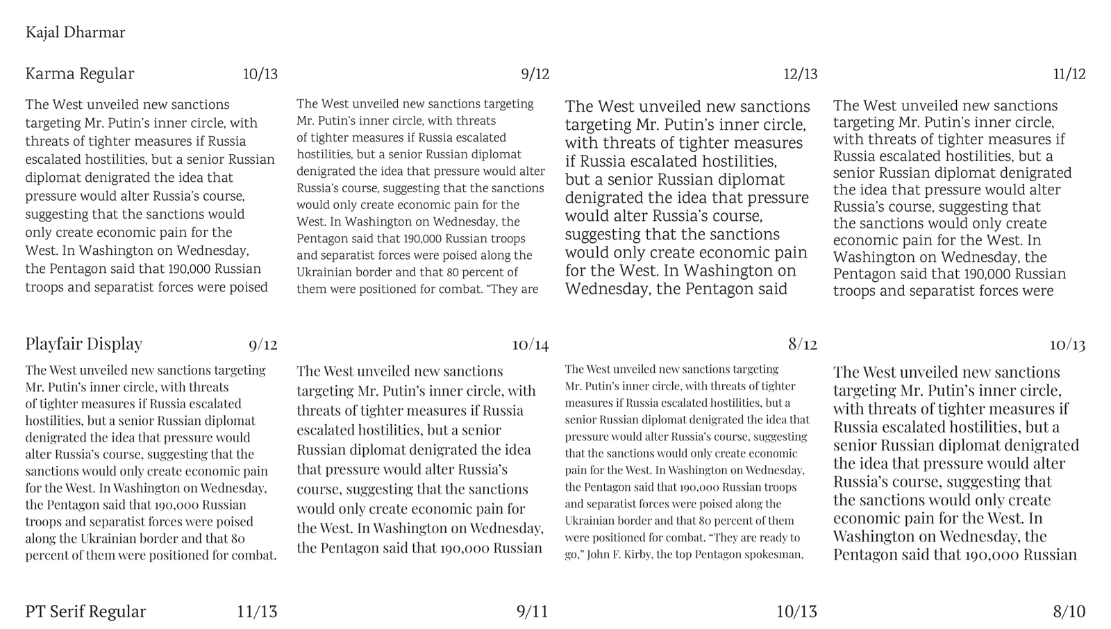
Font Tests 1/3
Font Tests 2/3
Font Tests 3/3
Rough Draft
Rough Draft
Version 1
Version 1
Version 2
Version 2
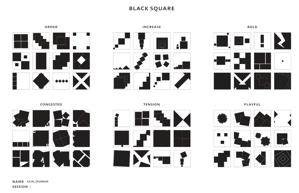
Black sqaures
The categories – Order, Increase, Bold, Congested, Tension, and Playful – were brought to life by tweaking the size and angle of the squares. Through the lens of design fundamentals such as depth, negative space, framing, and contrast, each set of squares took on a distinct personality, reflecting their respective themes. This assignment was designed to test the boundaries of inventiveness when faced with a simple toolkit. This challenge highlighted the power of these principles to evoke a range of emotions and narratives, proving that even the most basic elements can tell a compelling story when arranged with purpose and creativity.